Cubism Study
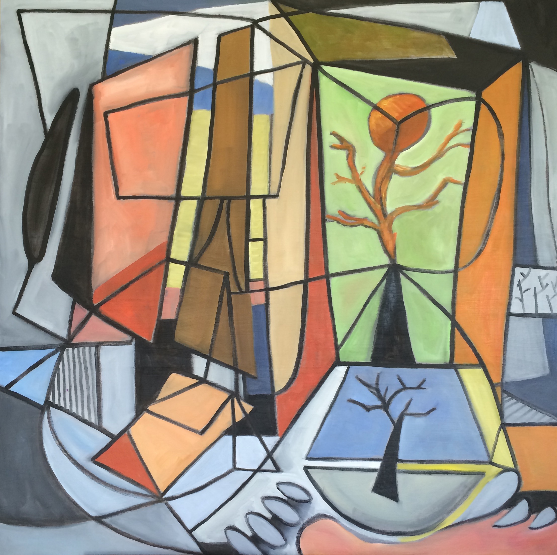
I actually painted this to go in our living room. We have a very modern living room and the focal point is an old mid century cubist painting, so I wanted to keep with the theme in the room. Since I can't afford any "real" cubist works, I decided to create my own. This one is fairly large - a 36x36. My husband commented that I got a little too carried away with the black lines, and maybe I did - making it look more like stained glass than an abstract. It was surprising difficult to do because I made the mistake of starting with the lines and then had to try to paint inside them. I think if I do another one, I'll do the outlines in pencil and add the black last! I do think I'll try another one because I really like this.
Birdies

Not sure if I'm finished with this yet, but I am having fun with this one. I combined my love of abstract with my love of portrait and figurative work - combined with my current obsession for red and just a little Warhol thrown in for fun - with the repeating figures.
I was actually trying to find a crowd pic but couldn't find one so I thought why don't I just make multiple copies of this model? I thought the crisscrossing legs would be cool... not sure it turned out that way though.
It's surprisingly hard to paint exact copies. You can see there are a lot of differences between them. It was easier to get the two models side by side but the one off to the left is way off. I plan to do this kind of painting again and see how close I can come to making exact replicas. I don't ever trace things but I might reconsider that - paint the first one and then duplicate it with tracing paper. Tracing has always seemed like cheating to me - although a lot of artists I really respect do some tracing. I might consider it only if I'm tracing the first model I paint. That way I'm tracing my own work.
This is in acrylic and I'm actually really starting to like working with it. It dries so frigging fast! I mean like almost after I put the paint on the canvas. And then it's forgiving... I can paint over things as often as I'd like and can completely cover black with just one or two coats. With oil I can push the paint around but I can't cover mistakes like that unless I wait for it to dry. So I'm liking that aspect.
I also love making drips. Sorry that might sound childish but hey ... the drips bring out the inner kid in me.
There are a lot of things unfinished in this painting, but I think I like it that way. At least I like it today... tomorrow ... who knows?
See if you can figure out why I called it Birdies. Haha
Royals

I hung these two abstracts at Market Central today. They are 24"x24" canvases gallery wrapped and then coated with clear resin.
They were really fun to do, and finishing them with clear resin really made a difference. I like it that they could be hung any number of ways - both pointed up, pointed down, white together or red together. They were an experiment and I used a lot of paint making them. I really like the way they turned out!
Cry, Cry Baby

Painted this over the weekend. It's large for me - on a 24"x48" gallery wrapped canvas.
I did it in acrylic because I didn't have time for oil paint to dry. I wanted to get some work out to Market Central because my artist friend Glenda Brown and I are sharing a wall.
Janice Joplin is incredibly hard to capture. Her looks and even her features seem to change from picture to picture... so I just focused on the picture I was working from.
Acrylic is also a challenge for me because I don't use it very often. I was really impressed with the masterson palette I used, because over the course of the three days I was working on it, the paint didn't dry out. That was really impressive. But working with the acrylic seems sluggish. The paint gets sticky so fast there's no time to blend your colors on the canvas. I used a gel medium with the paint to try to keep it pliable but it still dried too quickly. I do believe there are some mediums on the market I can get to slow down the drying time - I might look into that. I just need the paint to stay workable for long enough to blend. It may have also been that I wasn't using enough water while painting. On the flip side, the whole reason I used acrylics was for the fast drying time. So I guess you can't have it all!
I was encouraged with this portrait because my husband liked it so much, he actually wanted to keep it!
Royal

This abstract was an experiment - I was playing around. On reflection, I think red is a very strong color that seems to invoke a dramatic response. It seems like when I attempt non representational abstract expressionism my abstracts seem to have a violent nature - like they are shouting at me. On the bright side, at least my work is evoking an emotion. So I am wondering if the work that disturbs me the most, might also be my best work?
Paint your own Abstract!

Leah did a non representational abstract that she conceived!

Kristi did two 12x12 paintings working from a picture but changing the colors - great palette knife texture!

Nancy was another creative girl who came up with her concept!

Charlene did a great job with this abstract landscape of a sunset over water!

Here are the dance girls - Michelle (far right) did a beautiful job - love the colors she used!

Our other Michelle in the group did the cutest little squares - her use of color and texture on these was fantastic!
Little Bursts of Color and Market Central


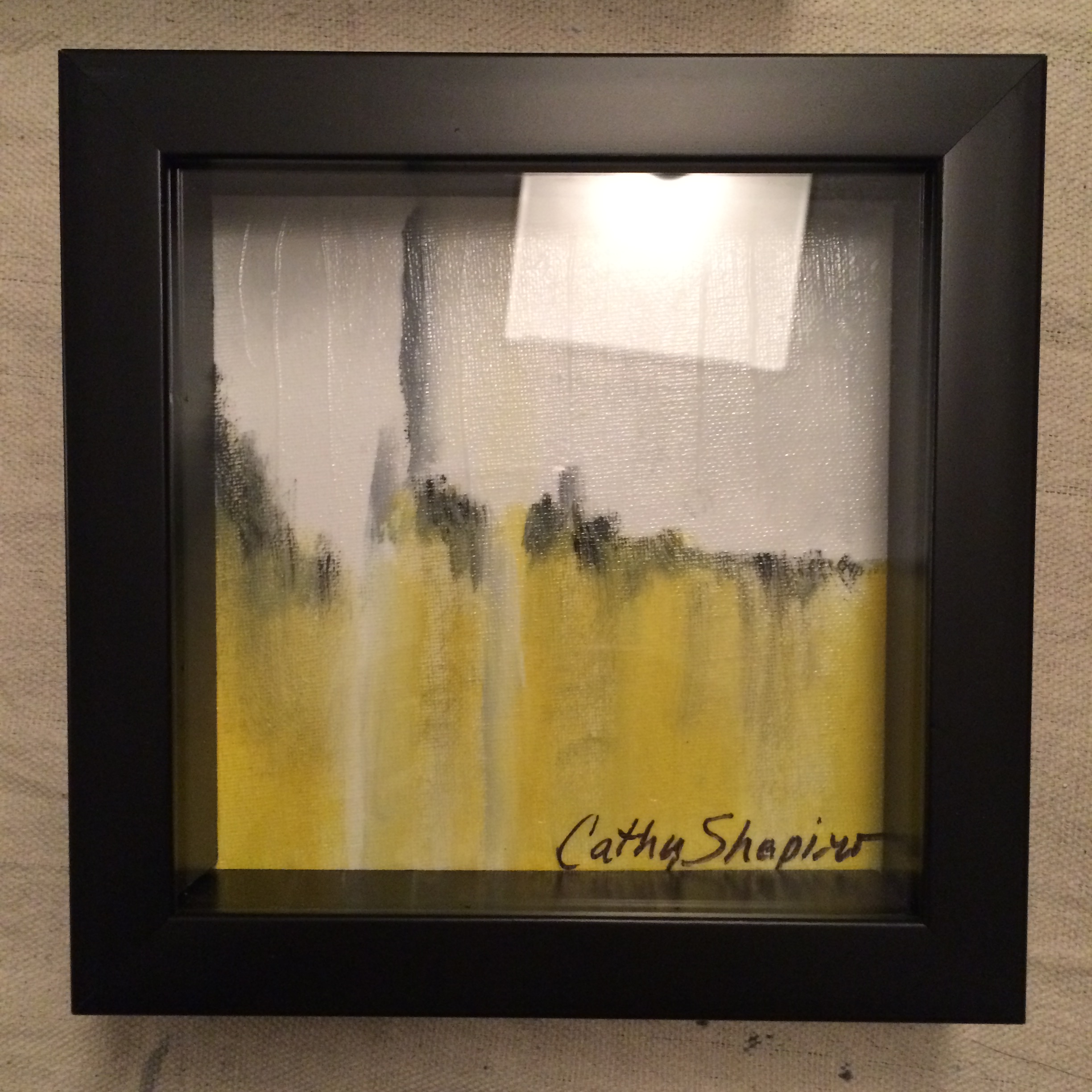
On Tuesday, I find out there's an opportunity to display some work at Market Central for this weekend's big Sidewalk Sale, so I spent most of yesterday getting ready for that. Artist Glenda Brown is sharing a wall with me, and we had to paint the wall, and hang some art.
I didn't have anything ready that I thought would work for the designer crowd that shops there except one abstract. So the one abstract (red and blue one I call "Eruption") is mine - the rest are Glenda's. Glenda is a fantastic portrait artist, and I've gotten to know her through Anne Enoch's Wednesday night painting from life group.

So I'm excited to now be at Market Central, and will devote some time to putting together more art for this wall!!!
Driven to Abstraction!

It's been so long since I posted! Crazy busy lately! I have been productive and have been painting, just not posting... haha!
I put a few hanging systems around the house. One in my office so I could get my paintings off the ground, and another in the kitchen. We have a very modern kitchen and so I painted a couple of abstracts that seemed to suit the room. ;)
This one was my fav of the two. Here's the other:

I plan to put a clear coat of epoxy resin on them. It will be an experiment since I've never done it before. I've ordered the stuff but it won't be here until the 18th so will have to wait a while.
Happy painting!
Doll
 I experimented with this, and really liked how it turned out. I have been reading Kintsler's "Painting Portraits" and his backgrounds are turpentine washes or vignettes - so I had to restrain myself but I tried to stay abstract on everything but the face. Even on the hands, I just used a few brush strokes to suggest them - rather than paint every detail (like I usually do).
I tried to make the focal point the face, but I think that making the doll lighter than the rest of the painting shifted the focus somewhat from the face. I am still pondering that.
This was a rather large work for me - a 24" x 30". I started on it yesterday, and finished it today. I was working from a very tiny photo. I ran out and got a frame for it because the artist group I am in will be exhibiting at Folks Folly - a really nice restaurant here in Memphis starting tomorrow, so I wanted to put this in the exhibit. :)
Newman Day 25

Maybe it's the holidays, maybe I've just painted too many Paul Newmans, but I just couldn't bring myself to finish this portrait. So I decided to leave it kind of abstract, and post it anyway. I am counting this as day 25. I am behind and have two more to do to catch up! Hopefully I will have some time to paint over the coming week. ;)
Pollution
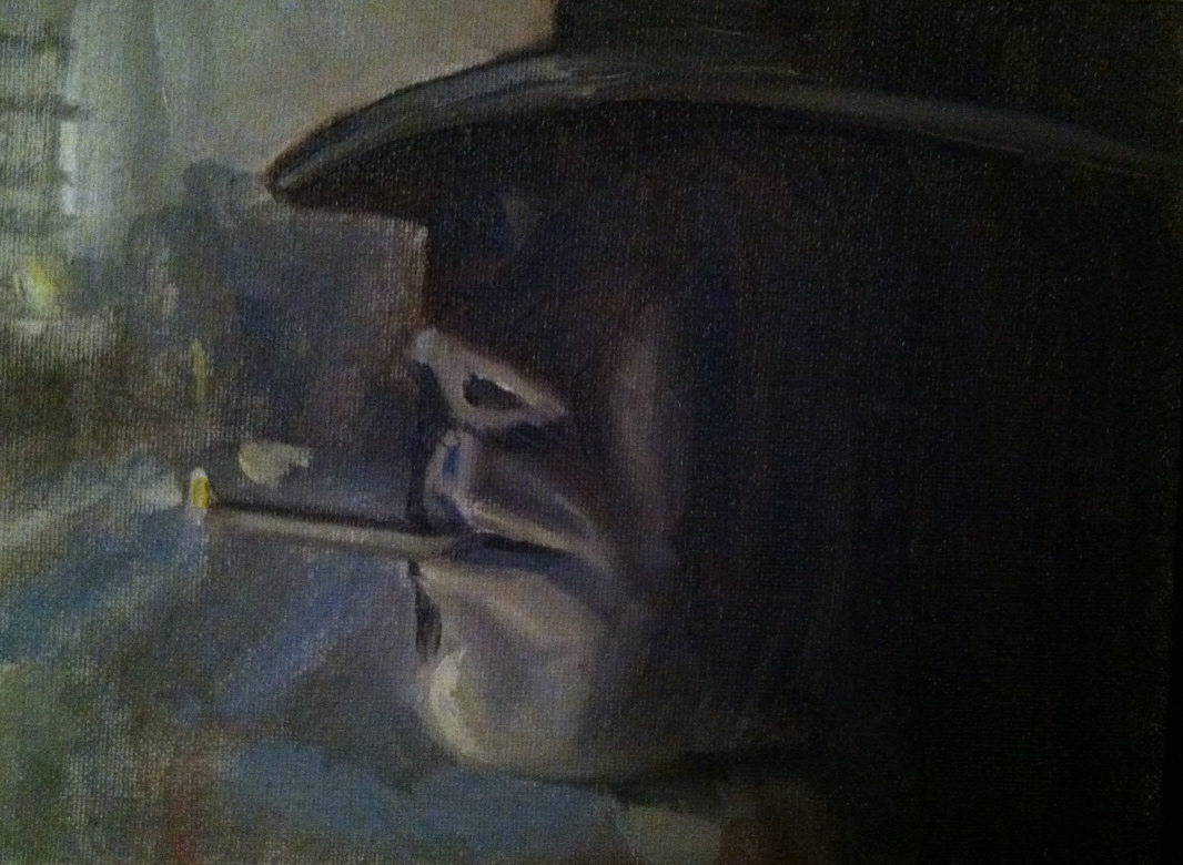
I love the whole concept of this scene - the way the light from the street silhouettes his face, the way his hat and hair obscure his face. I found this photo on someone's blog a long time ago, and always meant to paint it. This one spread off the brush like butta. Love it when that happens!
We are traveling tomorrow, so wanted to get an early start on today's painting - so this is my painting for Wednesday, the 26th.
Fire over water

Since I had some success with my abstract that I sent to I.O. Metro, and since I had to send it to them and won't get it back, I decided to do another abstract similar to the one I sent them. I used brighter colors and my inspiration for this one, like the last one was fire over water.
I find doing an abstract particularly hard to do. I'm so used to structure that it's very hard to get free. I am not really happy with this, but think that I need a lot more practice, and so will do a few abstracts over the next few days and see if I can get more comfortable with them. ;)
Abstract for I.O.Metro!
 Several weeks ago my husband told me about a contest at I.O. Metro (very cool furniture store chain). They were looking for local art, and the winners work would be reproduced on canvas and sold in their stores.
I don't normally do abstracts, but my husband encouraged me, and so I did this one and entered it in the contest.
Today I found out my piece was selected!
My art will hang on the walls of the I.O. Metro stores and maybe on the walls of many homes!
All I can say is WoW! I am so thankful, and so happy!
Several weeks ago my husband told me about a contest at I.O. Metro (very cool furniture store chain). They were looking for local art, and the winners work would be reproduced on canvas and sold in their stores.
I don't normally do abstracts, but my husband encouraged me, and so I did this one and entered it in the contest.
Today I found out my piece was selected!
My art will hang on the walls of the I.O. Metro stores and maybe on the walls of many homes!
All I can say is WoW! I am so thankful, and so happy!Garlicky
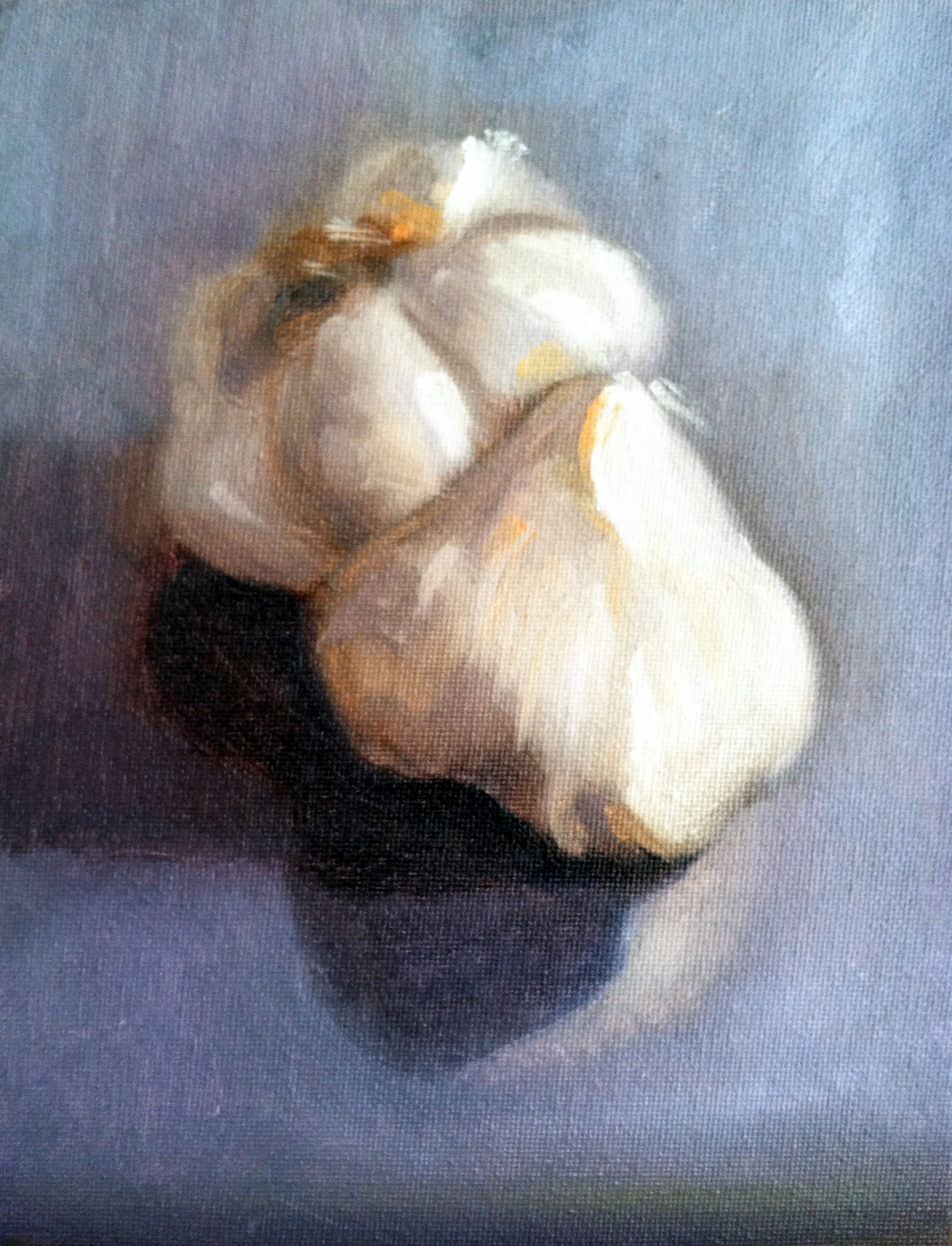 So here's todays effort. It's very abstract I think. Honestly I just didn't want to fuss too much over the details. The challenge here was not just the garlic, but also the double shadows. There was reflected light off the back of them and light from the side.
In the class I've been taking we use two brushes. One for the lights (anything that will have white in it) and one for the darks. That's really important. I just can't get those darkest darks if there is any white in the brush.
I've noticed lately that my paintings are very dark, and so was trying to lighten this one up a bit. So I didn't really stay true to the background which was black. I think it might be time to invest in some colored tablecloths!
Overall I'm happy with todays painting. I am trying to keep it loose and I think I achieved that today. Now tomorrow... that's another story!
So here's todays effort. It's very abstract I think. Honestly I just didn't want to fuss too much over the details. The challenge here was not just the garlic, but also the double shadows. There was reflected light off the back of them and light from the side.
In the class I've been taking we use two brushes. One for the lights (anything that will have white in it) and one for the darks. That's really important. I just can't get those darkest darks if there is any white in the brush.
I've noticed lately that my paintings are very dark, and so was trying to lighten this one up a bit. So I didn't really stay true to the background which was black. I think it might be time to invest in some colored tablecloths!
Overall I'm happy with todays painting. I am trying to keep it loose and I think I achieved that today. Now tomorrow... that's another story!Orange Crush
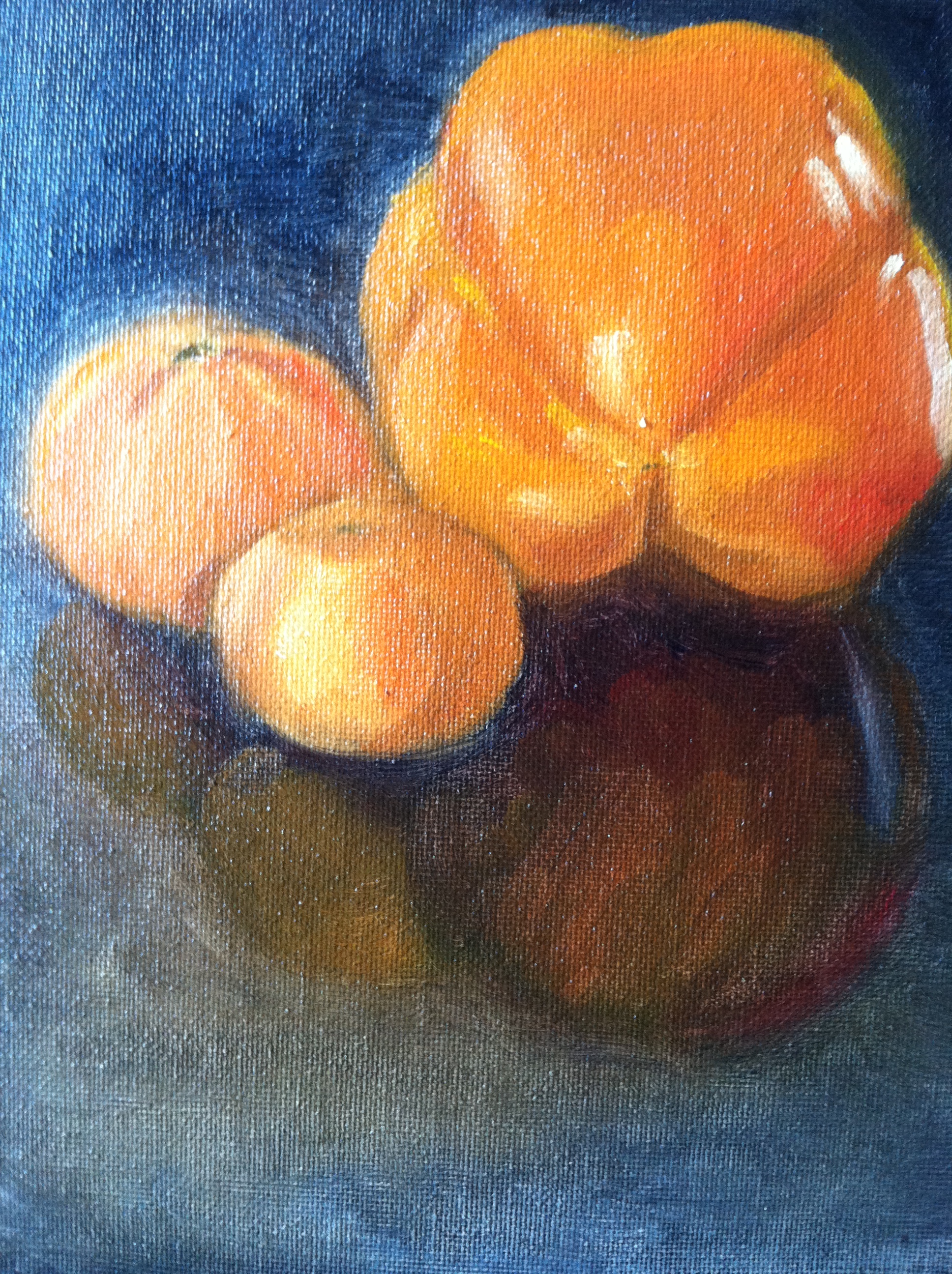
Todays painting was a study in orange. A bright orange bell pepper and two tangerines (who honestly had seen better days).
It was interesting to read about the color online today:
Stimulates appetite
Encourages socialization
Read more at: http://www.sensationalcolor.com/color-meaning/color-meaning-symbolism-psychology/all-about-the-color-orange-4354#.VGDs18n54g8 | Sensational Color
Dick van Dyke
 Dick van Dyke[/caption]
Okay, so I'm taking this art class at the Memphis College of Art, and our assignment was to mix colors and paint them randomly on a piece of paper. We had to mix at least two colors together and not repeat the colors. Then we were told to cut the paper up into small squares and glue them onto a canvas - creating a composition. Most of the students in the class made abstracts, but I love portraits, so couldn't resist doing one with my painted squares. It reminds me of Dick van Dyke wearing that straw hat in the Sound of Music. Ha! I guess it's good to think outside the "box."
Finished!

I really, really tried to leave out the detail - but I couldn't stop myself. So I don't think I can really call it an abstract - it's somewhere in between. Overall, I am happy with this one - it will look great in the music room and my son can keep this forever - a reminder of the wonderful experiences he is having with School of Rock.
More Abstract

I just started this one last weekend. I wanted to make this more abstract - but I feel like I'm putting too much detail in already. I'm going to try (very hard to do) to just finish the hands and the t-shirt and maybe do more to the background and call this one finished. But I am happy with how it's turning out so far.


