Ten Years
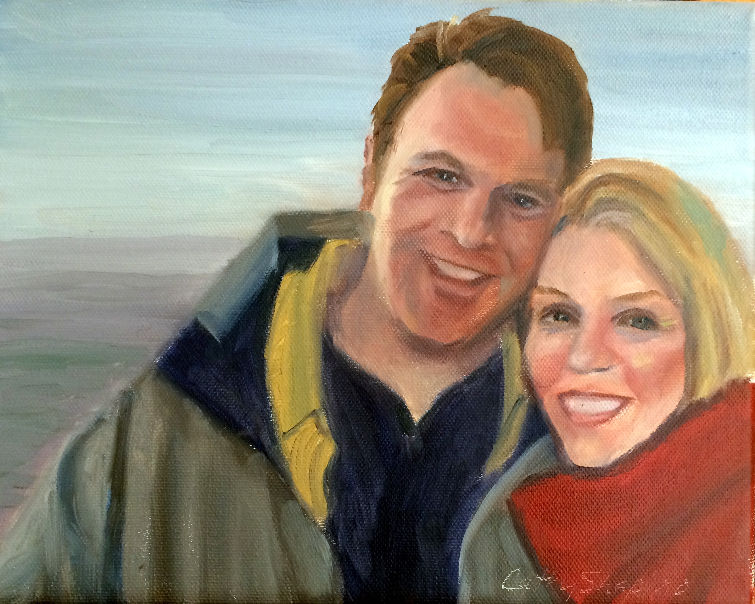
Yesterday I celebrated my ten year anniversary with this guy. So in celebration, I did a quick painting from this picture on our honeymoon.
I don't think I've attempted many self portraits, so it was a bit difficult to paint myself!
Painting from Life

We had another drop dead gorgeous model in painting from life group tonight. Anne is on a roll! She had beautiful features - full lips, long neck, bright blue eyes.
I think I am bringing too large of a canvas to the group because I tend to paint a little larger than life, which I really don't like.
All in all, I was semi-happy with this one. Half way through I messed up all the edges like I've seen Sue Foell do so often. It seemed to help because my painting was too controlled up until then.
There just isn’t enough time to do everything I would like in 2 and a half hours!
Learning to Stretch Canvas
 I stretched a fairly large canvas for the first time tonight. It's 22"x28".
My friend Jamie McMahan (absolutely fabulous portrait artist) shared a tip with me to get the stretchers square. He showed me you measure from corner to corner on one side, and then make it equal on the other side.
When I first put the stretchers together, I thought it looked square. After measuring both corners, I discovered I was a whole inch off! Measuring did the trick! After I put the canvas on, I put it in the frame and it fits perfectly!
I made the mistake of being too stingy with the canvas. In other words, I didn't cut enough to give myself room to really use the pliers on the canvas. As a result I stretched tight on the side that had enough room, and not tight enough on the sides without enough canvas so it was lumpy. So here's another trick. I just put some water on the back side of the canvas and being cotton - it shrunk and straightened out my canvas.
My corners are horrendous though! I will have to practice on them much more! Oh, and just one more tip - I use an electric stapler - so much easier on the hands!
Tag :
stretching canvas,
Sketch

Musings

So I worked on it a little more. I'm not sure that it's any better and I may work on it more.
Last night went to live painting group but I was really not having a good night and that was a real shame because we had a beautiful model. I had been up since 5:30 and I think I was just tired.
Here's my unfinished piece that I am very unhappy with!

Masquerade
 I am such a weirdo! Haha! I wanted to do a quick painting tonight and was just so fascinated with the Carnival of Venice pictures I found online that I did this.
It's surprisingly hard to do a blue sky, and blue water, and blue boats. They were all different shades of blue. The sky graduated from an ultramarine to a cerulean to an almost yellowish light blue. As you can see ,I didn't spend a lot of time on them.
But the thing that just absolutely fascinated me was the figure in that mask! I don't know if you can actually tell it's supposed to be a mask.... but that was what I was shooting for!
Search for Dark Flesh Tones
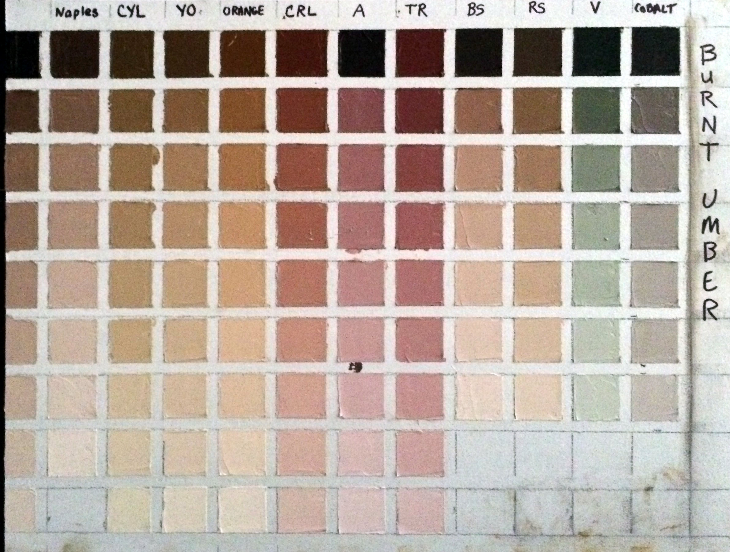
My goal was to find the right flesh tones for an African American girl that I plan to paint. So the color I started with was Burnt Umber.
Here's what I learned:
First I didn't mention in the last post that doing these exercises uses up a LOT of white! I'm using Titanium White.
Another thing I didn't mention is that I'm using the paints I use all the time - in my case they are Rembrandt brand, and it's important to use them because other brands have different tinting strengths and so my charts wouldn't be accurate if I used a different brand of paint on them.
The colors I used on this chart were: Naples Yellow, Cad Yellow Light, Yellow Ochre, Cad Red Light, Alizarin, Terra Rosa, Burnt Sienna, Raw Sienna, Viridian, and Cobalt.
While I was looking for really dark flesh tones, surprisingly I found that Burnt Umber can make some fantastic caucasian skin tones too. Especially the lighter ranges of Burnt Umber mixed with Naples, mixed with Yellow Ochre, and mixed with Burnt Sienna. Even just plain ole burnt umber mixed with white makes a nice neutral caucasian skin tone.
I found that Viridian must have more tinting strength than Burnt Umber because it overpowers it and the mixture turns out green. On the other hand Burnt Sienna seemingly has weak tinting strength.
Burnt Umber mixed with Cobalt gives you a fantastic very slightly greenish gray. I don't know about you, but for me it's very hard to find an easy way to mix a lively gray, so that's very useful to me.
Here's a picture of the girl I'm planning to paint.

From my exercise, I think the color that most closely represents her mid range skin tone is the two darkest versions of burnt umber mixed with raw sienna. The highlights seem to almost go a warm yellowish orange, and so for the highlights I will try the third color down of burnt umber mixed with orange. Then for the darkest dark on the right side of her face, it looks almost dark purple to me ... so there I will use the darkest value of burnt umber mixed with alizarin.
It will be exciting to see how the painting turns out. I've never done a color study "before" painting a portrait, so wish me luck.
Terra Rosa Torture!

Every major artist's book recommends the fledgling artist do their color charts. So I thought, "How hard could that be?" And today my mission was to knock out several of them. Boy was I in for a surprise!
First I went to four stores trying to find half inch or quarter inch masking tape. No luck at Lowe's, Walmart, Office Depot, or the craft store. So finally I end up buying green floral tape at the craft store cause it's the only tape I can find that's small enough (quarter inch). I also had trouble finding a T square - finally found one at the craft store.
Then I prepare the canvas. That took forever! Measuring and laying down the tape. But by this time I'm still happy go lucky - moving along - having a good attitude.
I start painting the squares - using my favorite color first - terra rosa. And I start off using a brush. Big mistake! Unless I plan to completely clean my brush each time, the color is just running together. I couldn't wipe off enough paint with a paper towel to make a clean stroke. So I turn to the palette knife. Now, I've never used one before, and I have to say it was absolute torture! As I type this my fingers and wrist are in pain. I'm not usually one to complain but half way through the messy ordeal, I was in agony. I couldn't make a smooth stroke, I couldn't get the darn thing into the square corners. Complete fail!
I realize that I do need to do my color charts. It's a rite of passage, a necessary evil. I realize doing them will help me, and make me grow as an artist. And it's not the color chart or mixing the color that bothers me - it was the darn palette knife!
Ok, enough ranting - off to find the alleve!
Post Notes:
I forgot to include how I made this chart. The first column is the pure color, and the successive blocks down the column show the color mixed with equal parts of white. Then in the remaining columns, the first block is the pure color (in this case terra rose) mixed with an equal part of another color. I am using Cadmium Yellow Light, Yellow Ochre, Cadmium Red Light, Transparent Oxide Red, Alizarin, Permanent Green Light, Viridian, Cobalt, and Ultramarine. Then down the columns, in the successive blocks each new color is mixed with an equal part of white. Hope that explains how I made it.
Things I learned from this exercise:
It's extremely messy!
You can't use a brush - this is really best suited for the palette knife. And that makes me wonder about my alla prima sessions - I probably need to use more brushes or clean them more often to get clean color.
How the addition of white changes the mixtures.
How the colors appear most vivid in the mid range.
Looking at the chart, the flesh tones that appeal to me the most are Terra Rosa mixed with Cad Yellow Light and Terra Rosa mixed with Permanent Green Light. They would make excellent caucasian flesh tones. I'm surprised at how the mixture turned out with Cad Yellow Light - it's not orange at all so that makes me think that Terra Rosa must have some blue or green in it to begin with.
Terra Rosa mixed with Cad Red Light would make good warm shadows for the ears, cheeks, and mouth, while Terra Rosa mixed with Alizarin would make great cool reds in those same areas.
Terra Rosa mixed with Ultramarine or mixed with Viridian makes really nice cool shadows for use under the chin in the neck area or receding planes on the forehead.
As I mentioned Terra Rosa is one of my favorite colors - but it's a recent addition to my palette. I have googled it but can't find the mixture to know how Terra Rosa is made. If anyone knows the color recipe please share with me!
Painting from Life
 I was needing some serious redemption after my latest "attempts" at painting, so tonight I thought I would try to paint something nice at our life painting group. My friend's daughter was the model, so I guess I just stacked up too much pressure to perform on myself!
The group was packed so I ended up in the corner, so didn't have a good angle. I think I captured her likeness somewhat, but I also think I was a bit tired of painting after painting the two roses earlier. So I'm hoping she will model for the group again, because I would like another shot at painting that beautiful red hair!
Life Painting

Our live painting group has nudes occasionally. This was my painting from last night. Especially where I live, people don't seem to have very much of an open mind about nudes - they think they are obscene. It seems like every art exhibit I've applied to be in, I'm told "no nudes."
I think the human body is a work of art, and is beautiful - no matter the shape, or age, or size. I also have observed that every true art gallery has nude statues and paintings. But here in Memphis, even the gallery owners admit they have to consign the nudes to a back room. So it appears that people in the Renaissance were much more open minded than we are today! It's a shame, and I guess I will continue to be a "rebel."
MGAL Spring Exhibit

So happy to be juried into the Memphis Germantown Art League's 2015 Spring Exhibit!! This is my very first juried exhibit! These paintings will be on display at the Germantown Center for the Performing Arts through May 27th. There is a reception next Saturday, May 9th from 4pm - 6pm


