Ian and Ellen
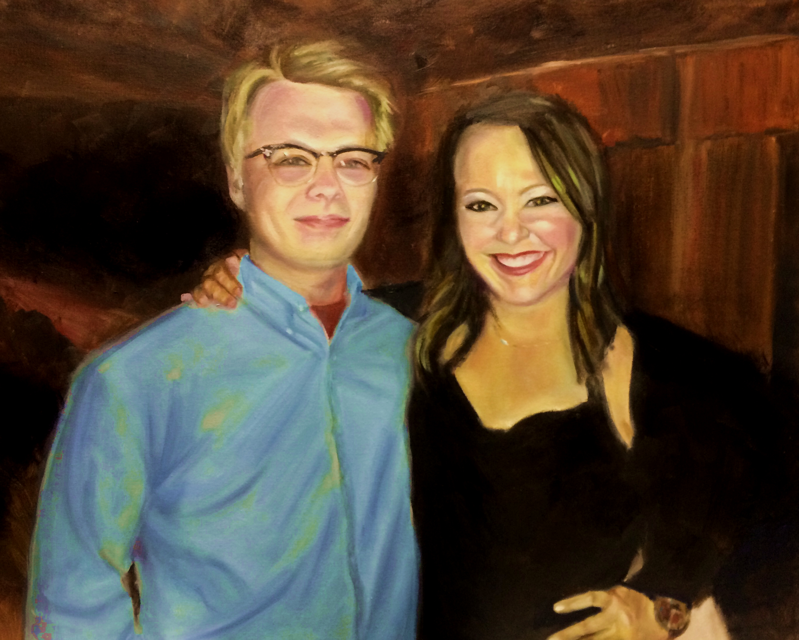
I haven't had time to paint, and our local art league has a show this month, so the day before the deadline, I rush to my easel and paint this picture from a lovely photograph I have of our children.
My son is about to graduate from high school and then move far, far away for College and my stepdaughter is getting married this fall, so both of them have these incredible life events going on, and they are top of mind, so it was only natural to paint them.
Because I was painting under a deadline, I used a new product called Liquin Impasto. I needed the paint to dry (like the next day) and I wanted to work in oils so I am happy to say it worked beautifully. The painting stayed wet long enough to mix the paint on the canvas, and it was completely dry within a few hours. It also comes in a tube which is really nice - honestly I don't think I used Liquin much before because it was so darn hard to get it out of the bottle.
So this deadline was a good thing - I found a new product that I really like. Because I always seem to paint under pressure, I think I'll be using it a lot!
Gone Fishing
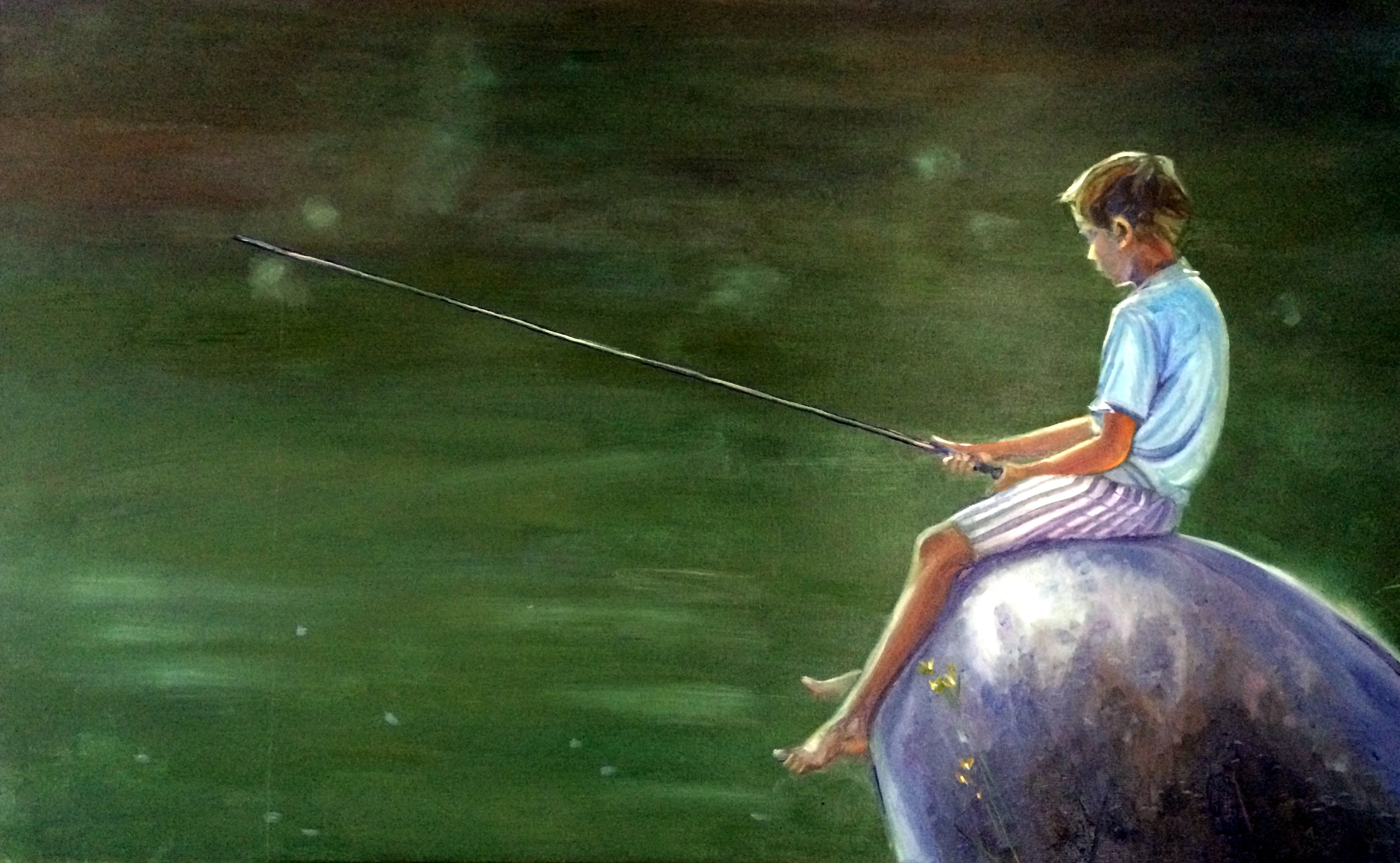
I'm tired of trying to second guess the art buying public and so decided this weekend to just get back to my roots and paint what I want to paint - which is people.
So did this painting of a boy fishing. It reminds me very much of my brother when he was young. I didn't start it until like 5:30 last night, and I never hooked up my lamp so it was hard to see the colors. I didn't realize how purple the rock was until I looked at it this morning. Maybe I need to work without light more often! Haha - because I love the colors.
This is a large piece - 30x48. I wouldn't have been able to finish it if there had been more detail. I spent a great deal of time on getting the green color right on the lake. I still had the light while working on it. I started off using viridian in the mix but quickly abandoned it and just mixed my own with ultramarine blue, lemon yellow and cad red light.
Cubism Study
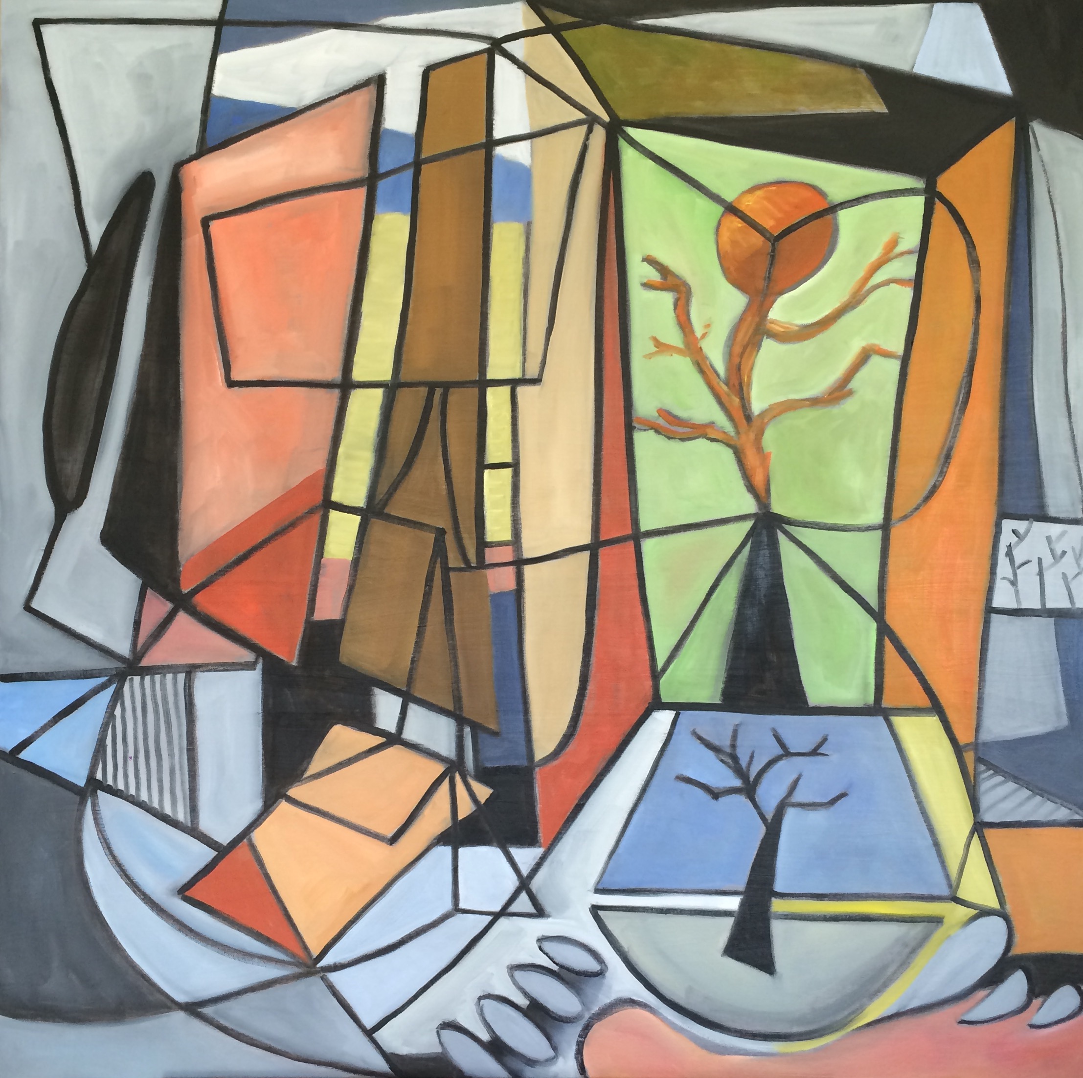
I actually painted this to go in our living room. We have a very modern living room and the focal point is an old mid century cubist painting, so I wanted to keep with the theme in the room. Since I can't afford any "real" cubist works, I decided to create my own. This one is fairly large - a 36x36. My husband commented that I got a little too carried away with the black lines, and maybe I did - making it look more like stained glass than an abstract. It was surprising difficult to do because I made the mistake of starting with the lines and then had to try to paint inside them. I think if I do another one, I'll do the outlines in pencil and add the black last! I do think I'll try another one because I really like this.
Shadows
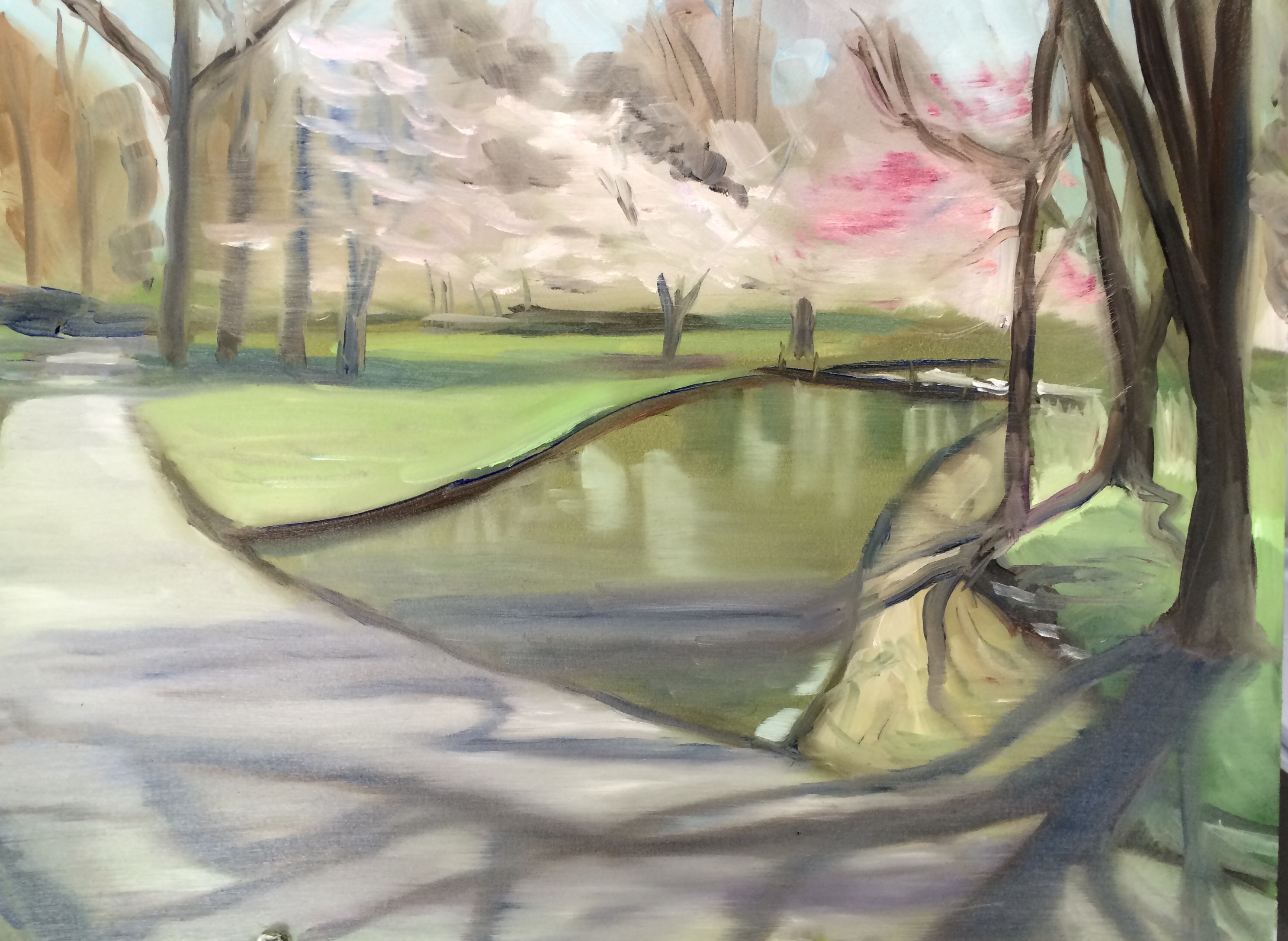
Plein Air Memphis had an outing this morning at the Botanic Gardens and I chose this little spot along the creek with the pretty cherry trees in bloom. But my painting was really awful! I wiped it off when I got home and did a quick do over. The composition is much the same but I tried to simplify and tried to capture the long shadows from the trees. Not really happy with the second attempt either, but it is better than the first. Landscapes continue to be so very challenging for me. It's difficult to process so much information and so many colors.
Experimenting with Color
I spent most of today reading Brian Keeler's book, "Dramatic Color in the Landscape." I'm so glad I did. He's a fantastic artist, and because I am on a mission to improve my landscapes, I thought some instruction was in order. I was planning on painting in the late afternoon, but I went out and took reference photos instead.
So around 10:30 at night, I started this. Not sure what size the painting is, I think a 20x20, but it's definitely larger than what I usually do. This is the result - Keeler style!
Germantown Station Park

Today I ran out late in the day for an hour or two to paint. I looked online and found a nice park nearby. It had an amazing fountain, but it was the light of the green grass in the distance and the interesting colors in the water that drew me to this spot. My technique was very messy and I had to leave very fast when a sudden thunderstorm sprung up but overall I was happy with this effort.
I felt very in tune with my painting. My palette was so simple. I used alizarin red, cad yellow, ultramarine blue, white, permanent green light and burnt umber. I had also bought myself a round brush and experimented with the thin lines of the tree branches.
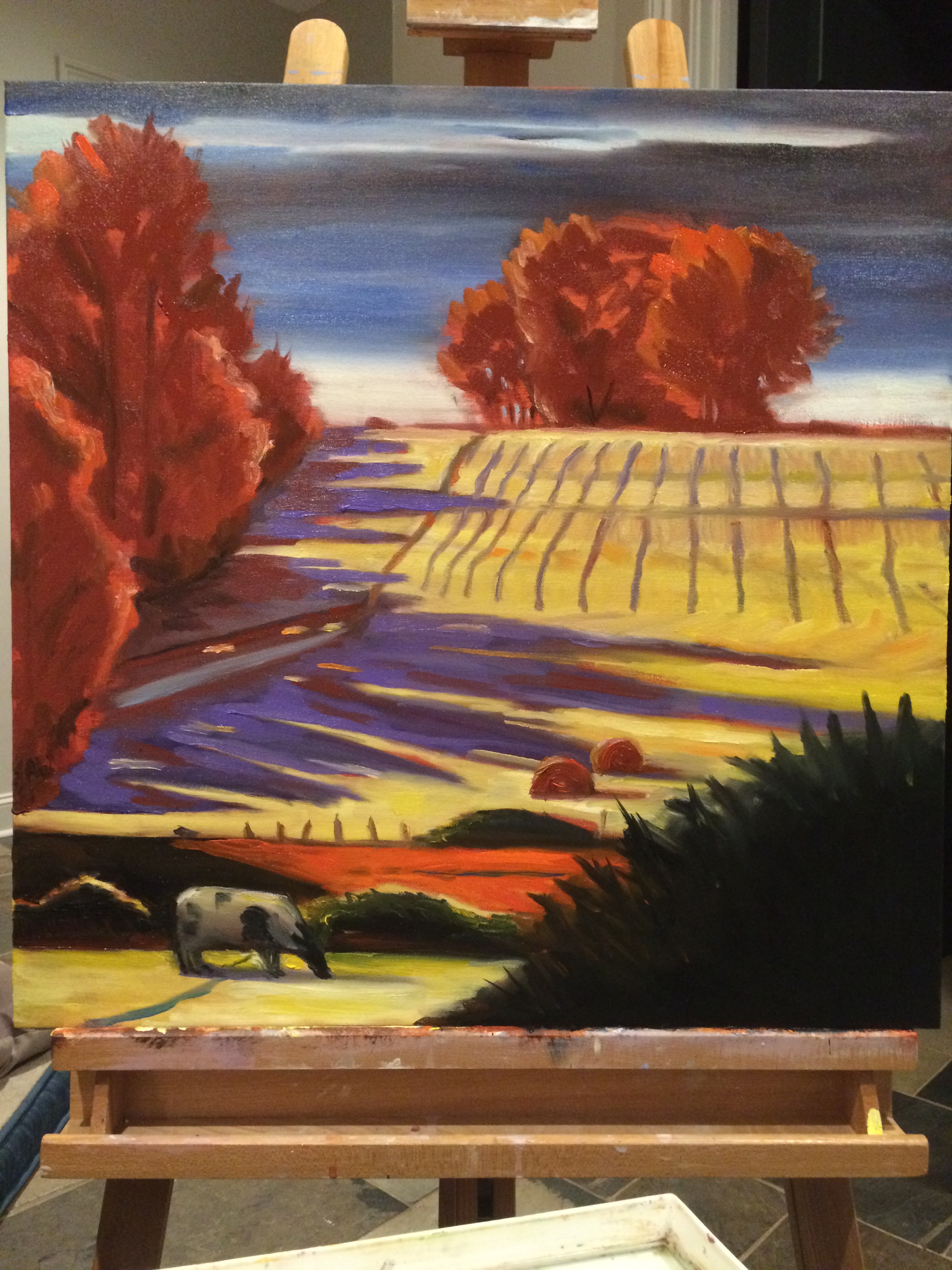
The Outback

Spent the morning out at Shelby Farms in the good company of Denise Rose for the March Plein Air Memphis outing. Wonderful location! I was pretty happy with my colors today especially the reflection of the trees in the water but not so happy with the trees. I imagine it's just going to take a while and perhaps the right kind of brushes to get the trees right, especially the big thicket of trees in the foreground. I didn't have any brushes for thin lines - must work on that! I do think I got closer to a focal point. My eyes are drawn to the trees beyond the lake, but my intention was for the thicket of trees to be the focal point - so I accidentally succeeded! Haha
Rain Clouds
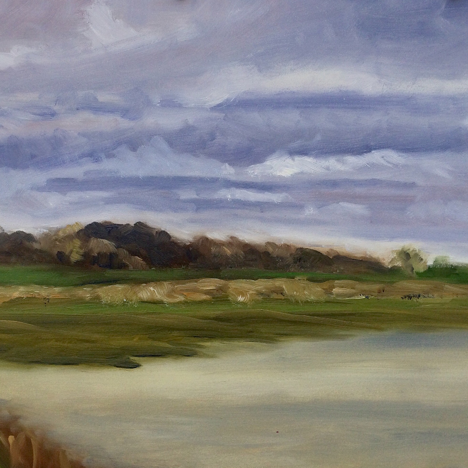
We had a break in the rain for a short period today... and I took the opportunity to get out of the house, go to Shelby Farms, and paint! I have a long way to go on my plein air work. I don't know why my landscapes are so blurry. I guess I get impatient and don't focus enough on details. A painting needs a focal point, and I must find a way to put one into my plein air paintings!
Nude Study
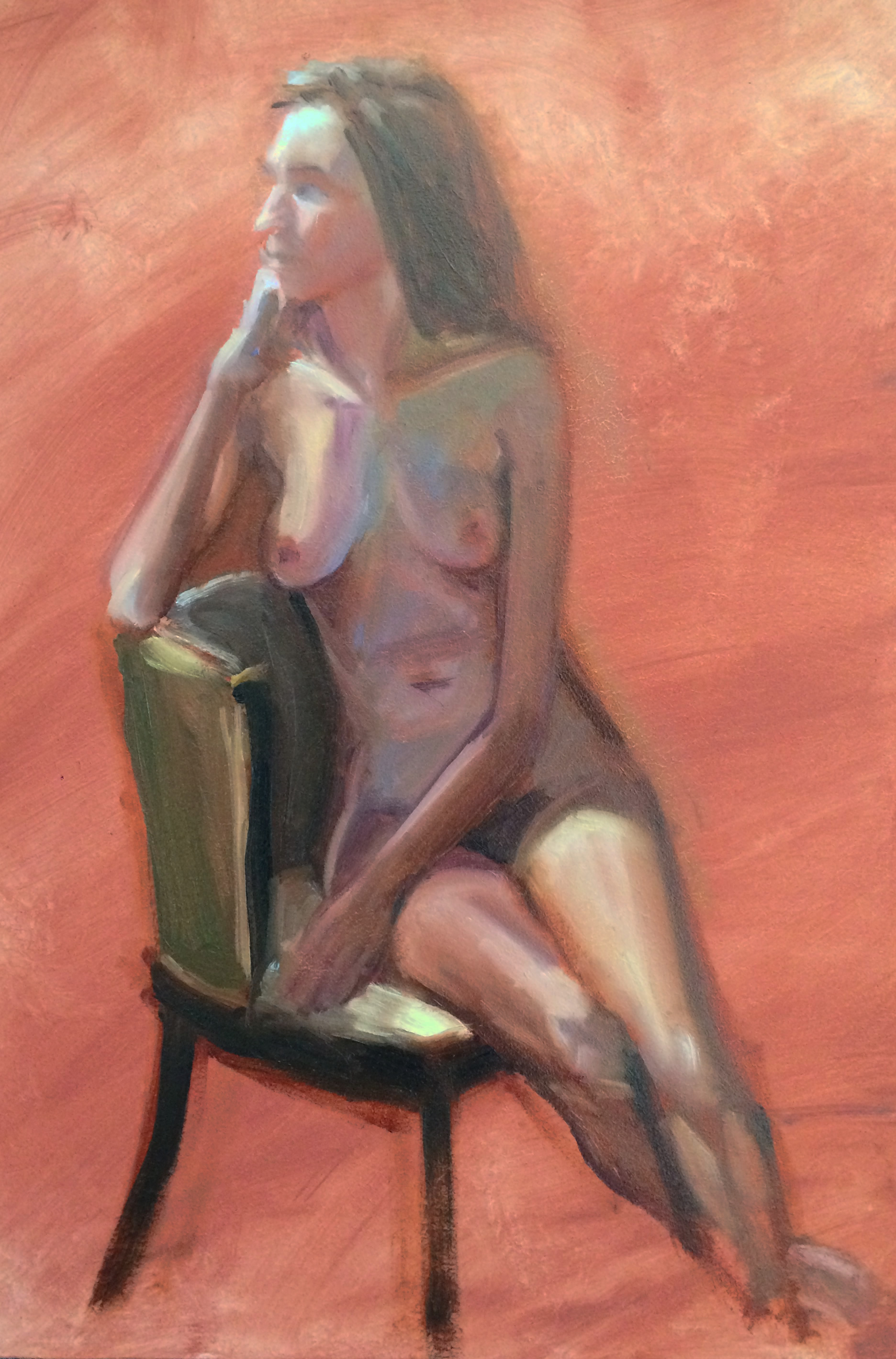
Went to the three hour live painting session at Nysha's today. Our model was very thin, and so I kept thinking the arms looked too thin but then that was what I saw. Now that I'm home, I think her left arm is too long. Again I didn't measure, and I don't have reference photos so it will have to just stay this way. I think the problem is the hand goes down a bit too far and the break in the arm needs to go up a smidge.
I realized on the way home that I didn't use a single drop of yellow ochre in her skin. But her skin seemed to have very cool tones so I stuck to the blues, purples and cooler reds. I loved the light - Nysha has such a talent with lighting the subjects. His lighting on her was very dramatic and I loved the pose.
Fitting all of this on a 12x16 board meant I couldn't get the detail I'd like on her face, hands, etc. but was a good study and I feel like I learned a lot!
The Back
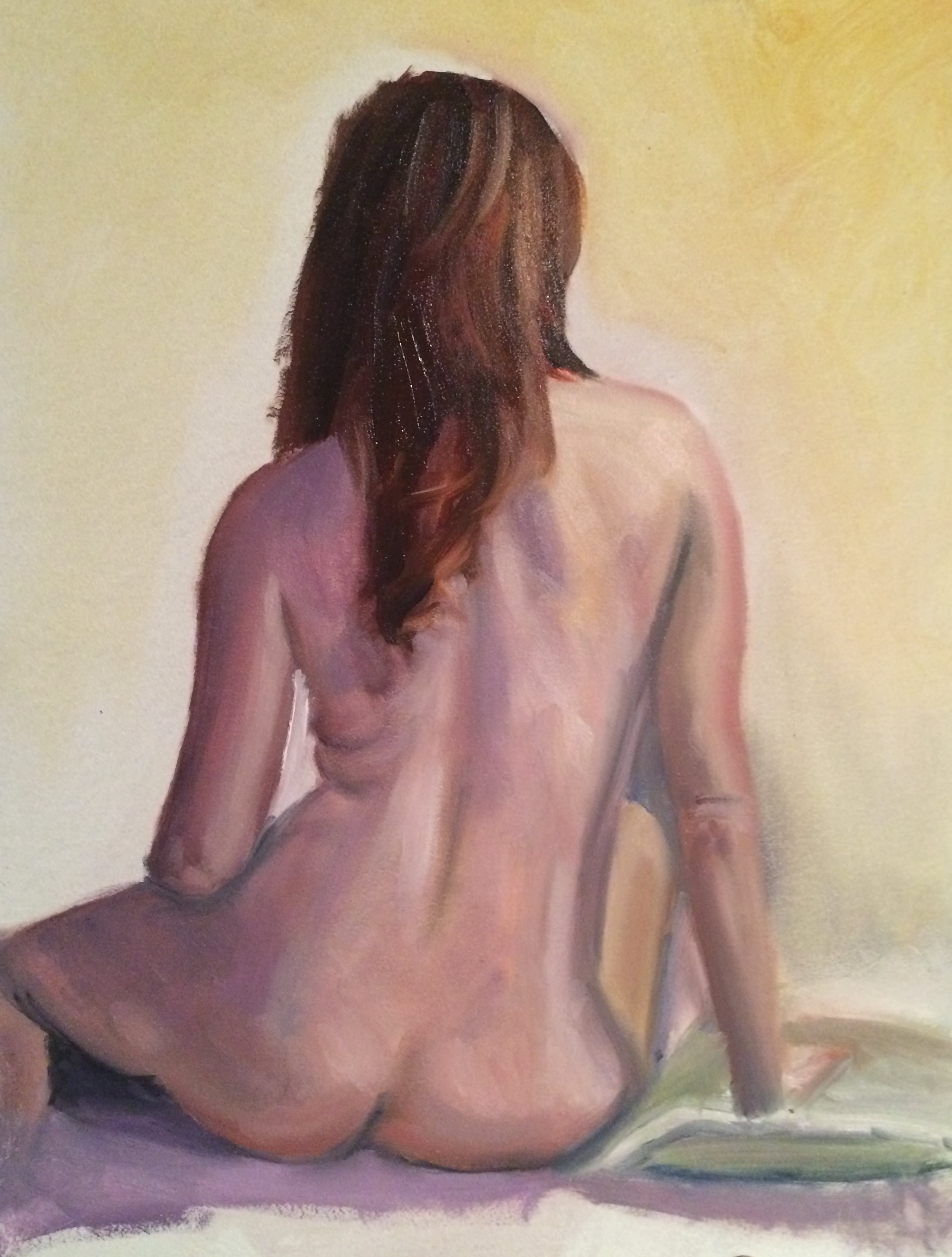
Happy to get back in the studio tonight. Painted this at Anne's tonight and am planning on painting again on Friday. It's been too long!


