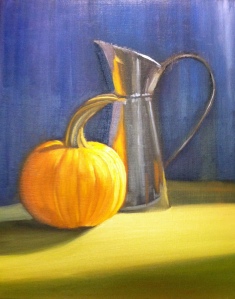
Pumpkin!

Worked on color values today. For the very first time, I started off too dark! Amazing! I rarely do that. But it was so much easier to make the colors lighter than it was to make them darker.
A pumpkin is an interesting thing to paint. There are so many colors in it. It took me a while to make it actually look like a pumpkin. Also the colors in the silver pitcher were so vibrant that there was very little silver at all it. The light was at a strange angle, leaving the pitcher in shadow and the pumpkin was a little back lit.
I'm learning so much in Sue Foell's class. I hope that I can get faster, and learn more how she uses an economy of brush strokes.
Tag :
oil painting,
painting,
Still Life - Class Two

Things to remember from class today:
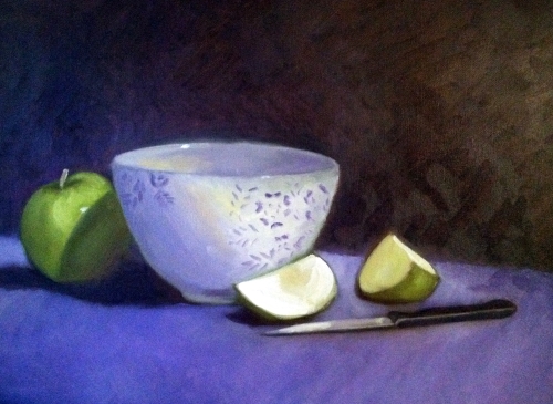
Recipe for creating shadows for white - mix violet (a cool red (such as Alizarin Crimson) and a warm blue (Ultramarine blue)) plus white to get a gray.
The importance of hard, soft and lost edges.
When applying the final highlight, load your brush and apply liberally.
Taking a new class!

I'm taking a class by Sue Foell. She's a well known portrait artist, and I want to take her portrait class later, but started with her still life class.
Here's the main thing I learned in class today:
Recipe for Shadows:
The object's color + the compliment of that color + a darker version of the object's color
(The exception to this rule is white)
Complementary colors are those located opposite each other on the color wheel.
This was a good subject - it uses the primary colors. Notice how the red reflects off the vase, and even the wall. I didn't get the shape of the vase just right - am not happy with the shape of the pear either, but I feel like I got close to the actual colors of the still life.
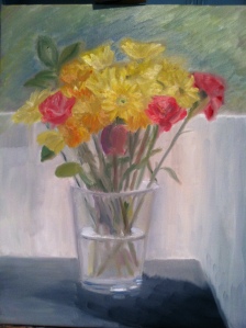
Ellen's Flowers

I don't really like painting still life - but I took a couple of hours this afternoon and painted some fading flowers that Ellen gave me. I hated to see them go, so now have a momento. ;)
There are about a thousand things I could do differently on this painting but overall I am semi-satisfied with it. I used a very limited palette - mars black, titanium white, lemon yellow, cad red deep, green oxide and a touch of ultramarine blue.


