Having a Ball II

Changed the angle and the background on the roses
Also painted this one during the day so had strong side light coming through the window
This is an 11 x 14
Over Three years!

I have taken quite the hiatus from painting. But I guess if you love something you will always come back to it.
I started easing back into it by starting an online course with Dennis Perrin on painting the flower portrait. The past couple of days I've painted some rather past their prime pink roses in a blue mason jar.
This is day one - "Having a Ball" will post day two next.
Ian and Ellen
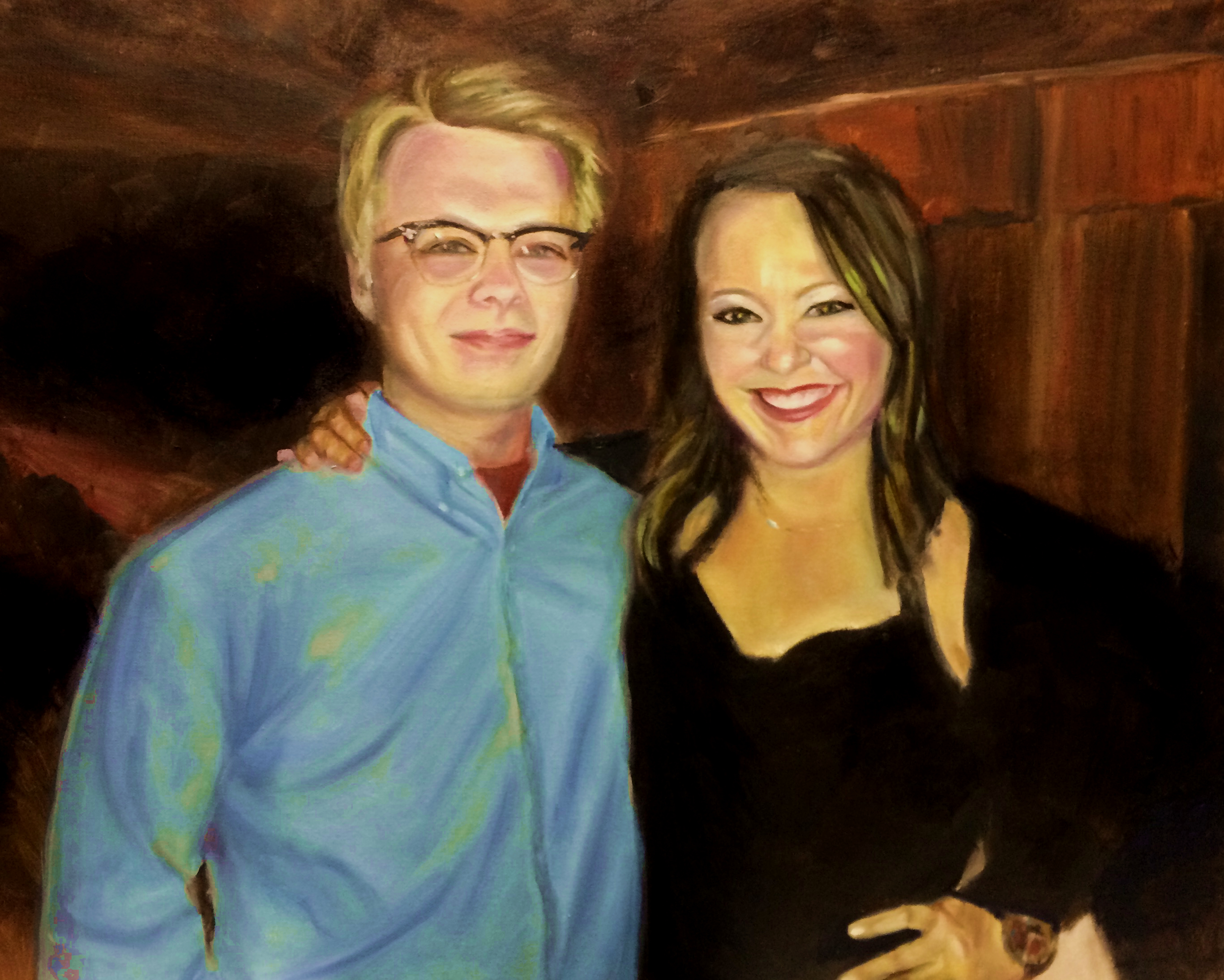
I haven't had time to paint, and our local art league has a show this month, so the day before the deadline, I rush to my easel and paint this picture from a lovely photograph I have of our children.
My son is about to graduate from high school and then move far, far away for College and my stepdaughter is getting married this fall, so both of them have these incredible life events going on, and they are top of mind, so it was only natural to paint them.
Because I was painting under a deadline, I used a new product called Liquin Impasto. I needed the paint to dry (like the next day) and I wanted to work in oils so I am happy to say it worked beautifully. The painting stayed wet long enough to mix the paint on the canvas, and it was completely dry within a few hours. It also comes in a tube which is really nice - honestly I don't think I used Liquin much before because it was so darn hard to get it out of the bottle.
So this deadline was a good thing - I found a new product that I really like. Because I always seem to paint under pressure, I think I'll be using it a lot!
Gone Fishing
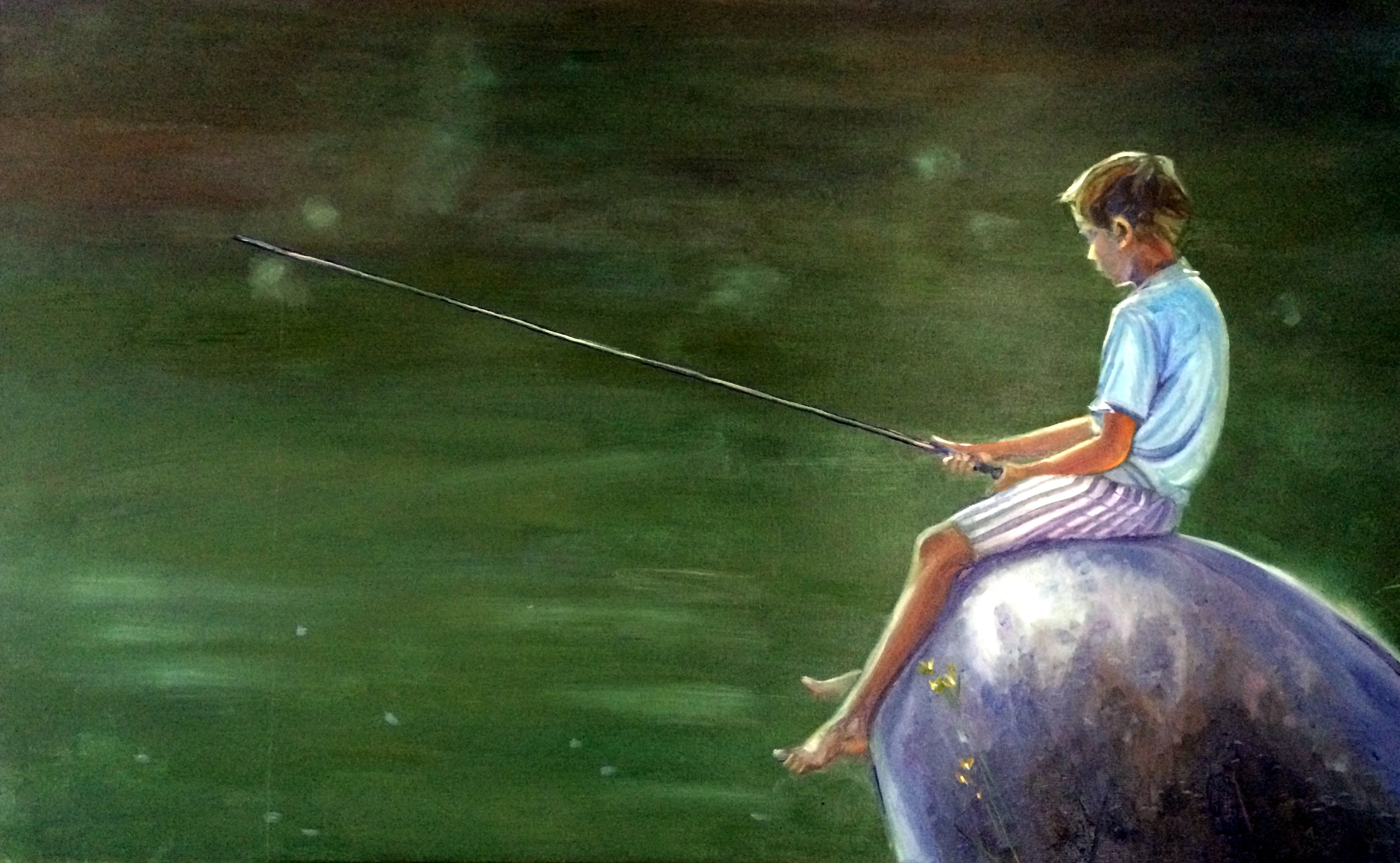
I'm tired of trying to second guess the art buying public and so decided this weekend to just get back to my roots and paint what I want to paint - which is people.
So did this painting of a boy fishing. It reminds me very much of my brother when he was young. I didn't start it until like 5:30 last night, and I never hooked up my lamp so it was hard to see the colors. I didn't realize how purple the rock was until I looked at it this morning. Maybe I need to work without light more often! Haha - because I love the colors.
This is a large piece - 30x48. I wouldn't have been able to finish it if there had been more detail. I spent a great deal of time on getting the green color right on the lake. I still had the light while working on it. I started off using viridian in the mix but quickly abandoned it and just mixed my own with ultramarine blue, lemon yellow and cad red light.
Cubism Study
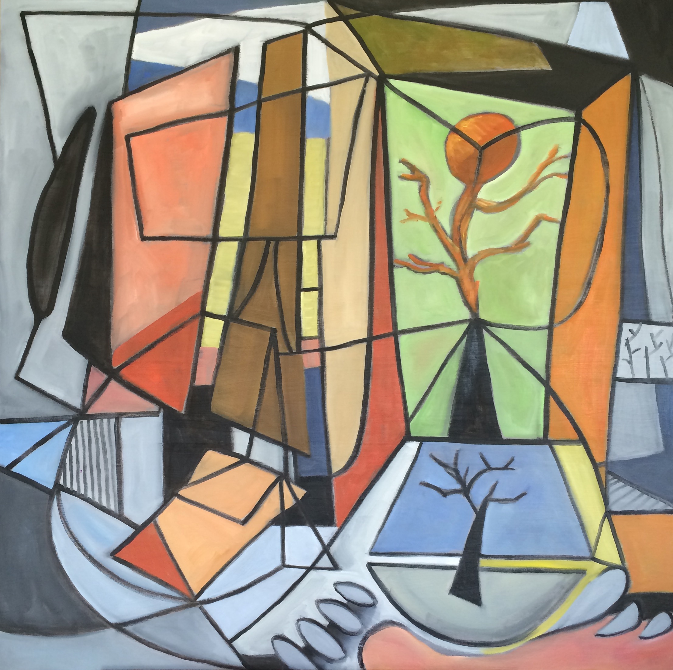
I actually painted this to go in our living room. We have a very modern living room and the focal point is an old mid century cubist painting, so I wanted to keep with the theme in the room. Since I can't afford any "real" cubist works, I decided to create my own. This one is fairly large - a 36x36. My husband commented that I got a little too carried away with the black lines, and maybe I did - making it look more like stained glass than an abstract. It was surprising difficult to do because I made the mistake of starting with the lines and then had to try to paint inside them. I think if I do another one, I'll do the outlines in pencil and add the black last! I do think I'll try another one because I really like this.
Experimenting with Color
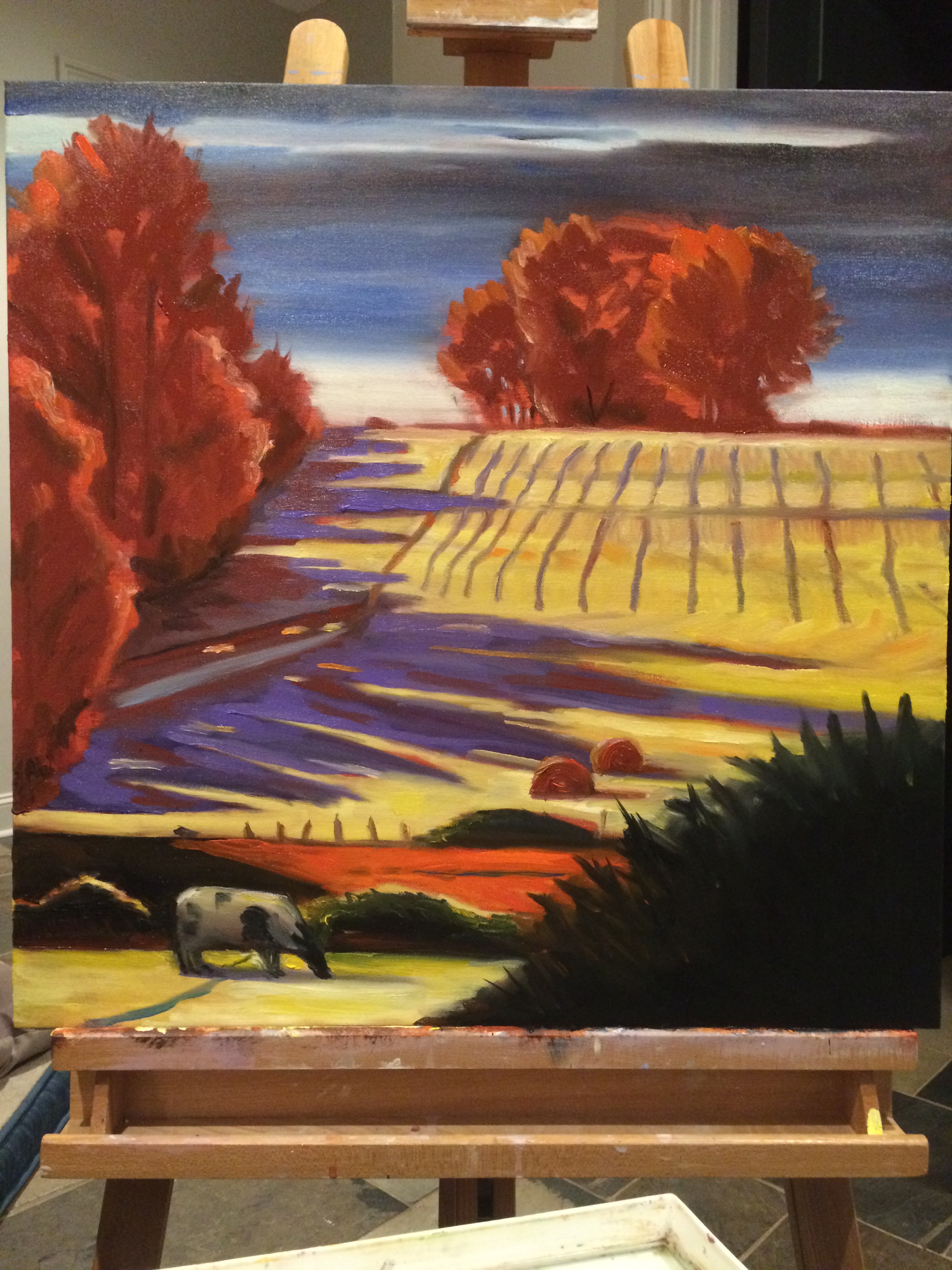
I spent most of today reading Brian Keeler's book, "Dramatic Color in the Landscape." I'm so glad I did. He's a fantastic artist, and because I am on a mission to improve my landscapes, I thought some instruction was in order. I was planning on painting in the late afternoon, but I went out and took reference photos instead.
So around 10:30 at night, I started this. Not sure what size the painting is, I think a 20x20, but it's definitely larger than what I usually do. This is the result - Keeler style!
Germantown Station Park

Today I ran out late in the day for an hour or two to paint. I looked online and found a nice park nearby. It had an amazing fountain, but it was the light of the green grass in the distance and the interesting colors in the water that drew me to this spot. My technique was very messy and I had to leave very fast when a sudden thunderstorm sprung up but overall I was happy with this effort.
I felt very in tune with my painting. My palette was so simple. I used alizarin red, cad yellow, ultramarine blue, white, permanent green light and burnt umber. I had also bought myself a round brush and experimented with the thin lines of the tree branches.
The Outback

Spent the morning out at Shelby Farms in the good company of Denise Rose for the March Plein Air Memphis outing. Wonderful location! I was pretty happy with my colors today especially the reflection of the trees in the water but not so happy with the trees. I imagine it's just going to take a while and perhaps the right kind of brushes to get the trees right, especially the big thicket of trees in the foreground. I didn't have any brushes for thin lines - must work on that! I do think I got closer to a focal point. My eyes are drawn to the trees beyond the lake, but my intention was for the thicket of trees to be the focal point - so I accidentally succeeded! Haha
Rain Clouds
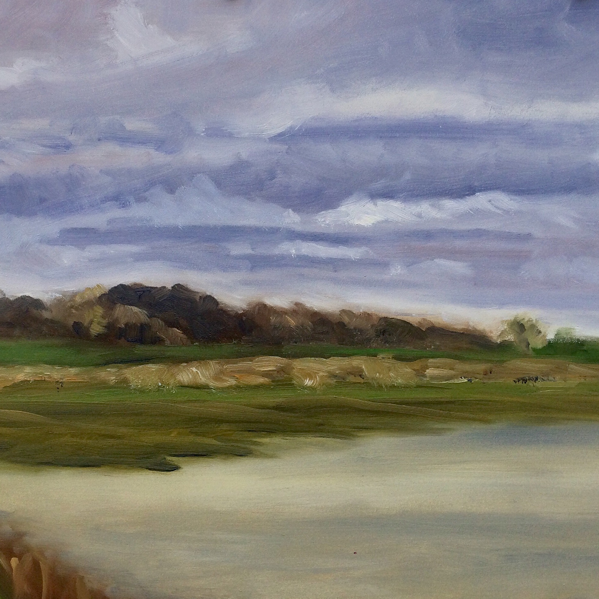
We had a break in the rain for a short period today... and I took the opportunity to get out of the house, go to Shelby Farms, and paint! I have a long way to go on my plein air work. I don't know why my landscapes are so blurry. I guess I get impatient and don't focus enough on details. A painting needs a focal point, and I must find a way to put one into my plein air paintings!
The Back
Happy to get back in the studio tonight. Painted this at Anne's tonight and am planning on painting again on Friday. It's been too long!
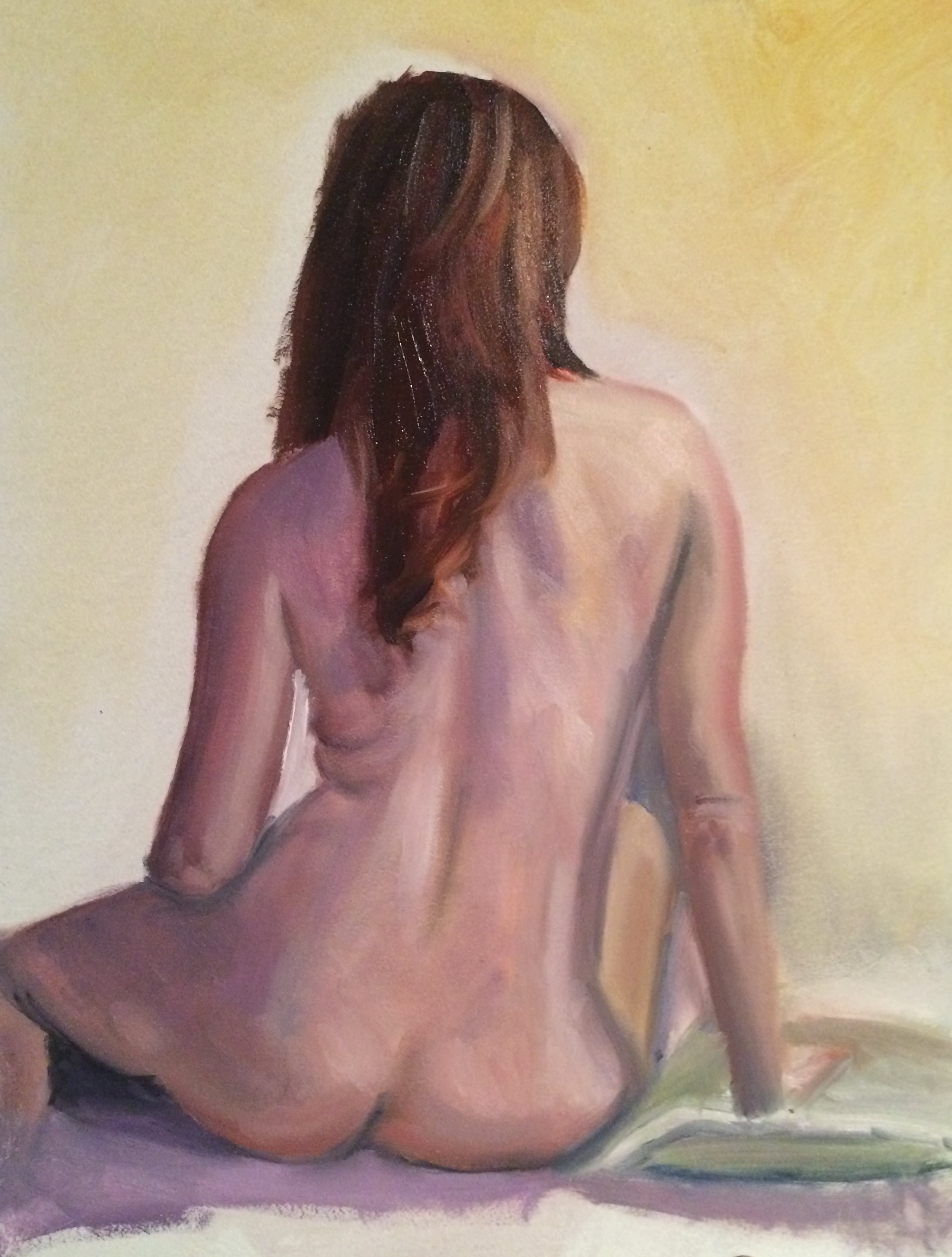
Dramatic Light

So much has been going on that I'm having to put painting on the back burner for now. But I did get to go to a live model session last Friday - this was the result. I absolutely loved the lighting and the working from her profile - it made it seem very dramatic to me.
I am thinking I won't have much time to paint until the Christmas Holidays, so I'm looking forward to that!
Male Nude Model

If you're coming from Facebook - made ya look!! Haha!! The truth is I planned it this way so there is a suggestion of nudity. It really shouldn't be offensive to anyone.
I've been traveling and working a lot so I haven't had time to paint, and I miss it so very much! This morning I was able to go to the Friday paint group and get this done. So happy to be painting. This was the first time I've painted a male nude - I was pretty happy with what I was able to get done in 3 hours. I will be traveling a lot more over the next three weeks so I'm not sure if I will find time to paint, but I hope so!
Search for Dark Flesh Tones
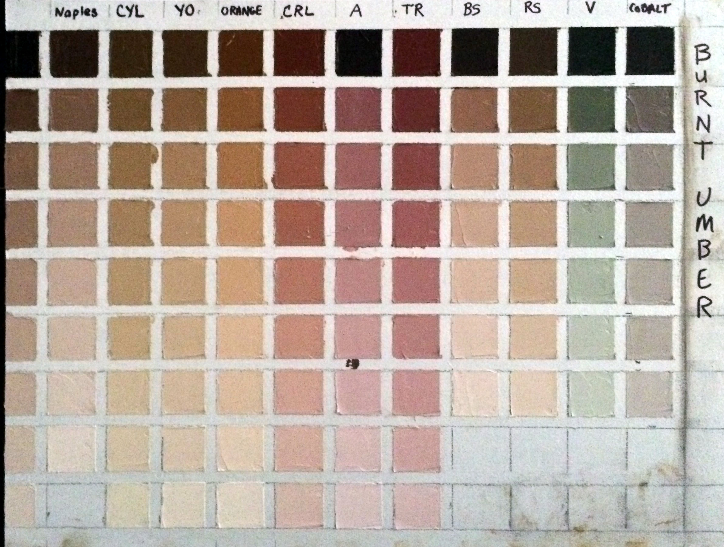
My goal was to find the right flesh tones for an African American girl that I plan to paint. So the color I started with was Burnt Umber.
Here's what I learned:
First I didn't mention in the last post that doing these exercises uses up a LOT of white! I'm using Titanium White.
Another thing I didn't mention is that I'm using the paints I use all the time - in my case they are Rembrandt brand, and it's important to use them because other brands have different tinting strengths and so my charts wouldn't be accurate if I used a different brand of paint on them.
The colors I used on this chart were: Naples Yellow, Cad Yellow Light, Yellow Ochre, Cad Red Light, Alizarin, Terra Rosa, Burnt Sienna, Raw Sienna, Viridian, and Cobalt.
While I was looking for really dark flesh tones, surprisingly I found that Burnt Umber can make some fantastic caucasian skin tones too. Especially the lighter ranges of Burnt Umber mixed with Naples, mixed with Yellow Ochre, and mixed with Burnt Sienna. Even just plain ole burnt umber mixed with white makes a nice neutral caucasian skin tone.
I found that Viridian must have more tinting strength than Burnt Umber because it overpowers it and the mixture turns out green. On the other hand Burnt Sienna seemingly has weak tinting strength.
Burnt Umber mixed with Cobalt gives you a fantastic very slightly greenish gray. I don't know about you, but for me it's very hard to find an easy way to mix a lively gray, so that's very useful to me.
Here's a picture of the girl I'm planning to paint.

From my exercise, I think the color that most closely represents her mid range skin tone is the two darkest versions of burnt umber mixed with raw sienna. The highlights seem to almost go a warm yellowish orange, and so for the highlights I will try the third color down of burnt umber mixed with orange. Then for the darkest dark on the right side of her face, it looks almost dark purple to me ... so there I will use the darkest value of burnt umber mixed with alizarin.
It will be exciting to see how the painting turns out. I've never done a color study "before" painting a portrait, so wish me luck.
Terra Rosa Torture!

Every major artist's book recommends the fledgling artist do their color charts. So I thought, "How hard could that be?" And today my mission was to knock out several of them. Boy was I in for a surprise!
First I went to four stores trying to find half inch or quarter inch masking tape. No luck at Lowe's, Walmart, Office Depot, or the craft store. So finally I end up buying green floral tape at the craft store cause it's the only tape I can find that's small enough (quarter inch). I also had trouble finding a T square - finally found one at the craft store.
Then I prepare the canvas. That took forever! Measuring and laying down the tape. But by this time I'm still happy go lucky - moving along - having a good attitude.
I start painting the squares - using my favorite color first - terra rosa. And I start off using a brush. Big mistake! Unless I plan to completely clean my brush each time, the color is just running together. I couldn't wipe off enough paint with a paper towel to make a clean stroke. So I turn to the palette knife. Now, I've never used one before, and I have to say it was absolute torture! As I type this my fingers and wrist are in pain. I'm not usually one to complain but half way through the messy ordeal, I was in agony. I couldn't make a smooth stroke, I couldn't get the darn thing into the square corners. Complete fail!
I realize that I do need to do my color charts. It's a rite of passage, a necessary evil. I realize doing them will help me, and make me grow as an artist. And it's not the color chart or mixing the color that bothers me - it was the darn palette knife!
Ok, enough ranting - off to find the alleve!
Post Notes:
I forgot to include how I made this chart. The first column is the pure color, and the successive blocks down the column show the color mixed with equal parts of white. Then in the remaining columns, the first block is the pure color (in this case terra rose) mixed with an equal part of another color. I am using Cadmium Yellow Light, Yellow Ochre, Cadmium Red Light, Transparent Oxide Red, Alizarin, Permanent Green Light, Viridian, Cobalt, and Ultramarine. Then down the columns, in the successive blocks each new color is mixed with an equal part of white. Hope that explains how I made it.
Things I learned from this exercise:
It's extremely messy!
You can't use a brush - this is really best suited for the palette knife. And that makes me wonder about my alla prima sessions - I probably need to use more brushes or clean them more often to get clean color.
How the addition of white changes the mixtures.
How the colors appear most vivid in the mid range.
Looking at the chart, the flesh tones that appeal to me the most are Terra Rosa mixed with Cad Yellow Light and Terra Rosa mixed with Permanent Green Light. They would make excellent caucasian flesh tones. I'm surprised at how the mixture turned out with Cad Yellow Light - it's not orange at all so that makes me think that Terra Rosa must have some blue or green in it to begin with.
Terra Rosa mixed with Cad Red Light would make good warm shadows for the ears, cheeks, and mouth, while Terra Rosa mixed with Alizarin would make great cool reds in those same areas.
Terra Rosa mixed with Ultramarine or mixed with Viridian makes really nice cool shadows for use under the chin in the neck area or receding planes on the forehead.
As I mentioned Terra Rosa is one of my favorite colors - but it's a recent addition to my palette. I have googled it but can't find the mixture to know how Terra Rosa is made. If anyone knows the color recipe please share with me!
Painting from Life
 I was needing some serious redemption after my latest "attempts" at painting, so tonight I thought I would try to paint something nice at our life painting group. My friend's daughter was the model, so I guess I just stacked up too much pressure to perform on myself!
The group was packed so I ended up in the corner, so didn't have a good angle. I think I captured her likeness somewhat, but I also think I was a bit tired of painting after painting the two roses earlier. So I'm hoping she will model for the group again, because I would like another shot at painting that beautiful red hair!
Life Painting

Our live painting group has nudes occasionally. This was my painting from last night. Especially where I live, people don't seem to have very much of an open mind about nudes - they think they are obscene. It seems like every art exhibit I've applied to be in, I'm told "no nudes."
I think the human body is a work of art, and is beautiful - no matter the shape, or age, or size. I also have observed that every true art gallery has nude statues and paintings. But here in Memphis, even the gallery owners admit they have to consign the nudes to a back room. So it appears that people in the Renaissance were much more open minded than we are today! It's a shame, and I guess I will continue to be a "rebel."
Delta Blues
 Ok so a winery here is having a label contest, and the name of the winery is "Delta Blues." A friend of mine asked me to enter the contest today, so I did this real quick. Seriously quick - like less than an hour and it probably shows! Haha. But there is something about the rough painting of this man that I really like. I like things not being so controlled and perfect.
 Painting from Life
 Did this last night in painting from life class. Again, I didn't measure. I don't know why I refuse to do that. I was also too lazy to refresh my paints so they were kind of sticky. I ended up making the head a little larger than life size, so was unhappy with that. But I was happy with achieving a semi semblance of curly hair - and thought I got the likeness pretty close. ;)
 Painting from Life
 A good friend of mine was the model for our painting from life group last night. Again, I did not measure well enough. I did not get her nose in the right position! On the flip side, I thought I got her eyes right and was semi-happy with the skin tones.
Red Acetate

Ann Enoch (who hosts our life painting group in her studio) gave me the absolute coolest thing tonight! A red acetate frame! She was sitting next to me, and I commented on how nice and glassy she made the models eyes and Anne looked at my painting and she immediately recognized the problem - my highlights weren't bright enough! She gave me the red acetate frame to look through to help judge my values. I was blown away by how much it helped. Before using it, my painting looked so flat - there was no life in it. Using the acetate I saw that I wasn't making my highlights light enough!
Love this group! I learn so much from them!
As for the painting - I really liked it while I was there but I think subconsciously I knew I needed to work on her mouth more. In particular the right side that is in shadow is too bright red - I should have toned it down with some green or made it more purple. Also her mouth was not as crooked as I made it in the painting. To be honest with myself, I was thinking that the crook in her mouth gave her character - when in actuality her mouth was much straighter. I need to quit adding things that aren't there and stick to painting what really IS there. But on the other hand ... hmmm... there IS no other hand!


