Pumpkin!

Worked on color values today. For the very first time, I started off too dark! Amazing! I rarely do that. But it was so much easier to make the colors lighter than it was to make them darker.
A pumpkin is an interesting thing to paint. There are so many colors in it. It took me a while to make it actually look like a pumpkin. Also the colors in the silver pitcher were so vibrant that there was very little silver at all it. The light was at a strange angle, leaving the pitcher in shadow and the pumpkin was a little back lit.
I'm learning so much in Sue Foell's class. I hope that I can get faster, and learn more how she uses an economy of brush strokes.
Tag :
oil painting,
painting,
Still Life - Class Two

Things to remember from class today:
Recipe for creating shadows for white - mix violet (a cool red (such as Alizarin Crimson) and a warm blue (Ultramarine blue)) plus white to get a gray.
The importance of hard, soft and lost edges.
When applying the final highlight, load your brush and apply liberally.
Taking a new class!

I'm taking a class by Sue Foell. She's a well known portrait artist, and I want to take her portrait class later, but started with her still life class.
Here's the main thing I learned in class today:
Recipe for Shadows:
The object's color + the compliment of that color + a darker version of the object's color
(The exception to this rule is white)
Complementary colors are those located opposite each other on the color wheel.
This was a good subject - it uses the primary colors. Notice how the red reflects off the vase, and even the wall. I didn't get the shape of the vase just right - am not happy with the shape of the pear either, but I feel like I got close to the actual colors of the still life.
Ellen's Flowers

I don't really like painting still life - but I took a couple of hours this afternoon and painted some fading flowers that Ellen gave me. I hated to see them go, so now have a momento. ;)
There are about a thousand things I could do differently on this painting but overall I am semi-satisfied with it. I used a very limited palette - mars black, titanium white, lemon yellow, cad red deep, green oxide and a touch of ultramarine blue.

Revisions to Welles Crowther

I think that it really helps when painting a portrait to actually know the subject. I've looked at several photographs of this brave young man and saw that I needed to make some big revisions to the painting. I'm not finished yet, but wanted to post how much the portrait is changing from the original concept.
The amazing thing has been the effect it has had on my son, who is 16. He had to write an essay at school about the qualities of a hero, and chose Welles Crowther as his subject. He wouldn't have even known about this young man if I hadn't been working on his portrait, so this has been a blessing to teach my son more about selflessness, caring about others, and the difference that one person can make on the lives of so many others.
American Hero - Welles Crowther
[caption id="attachment_235" align="alignnone" width="224"]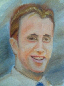 The Man in the Red Bandana[/caption]
 The Man in the Red Bandana[/caption]


