Dramatic Light
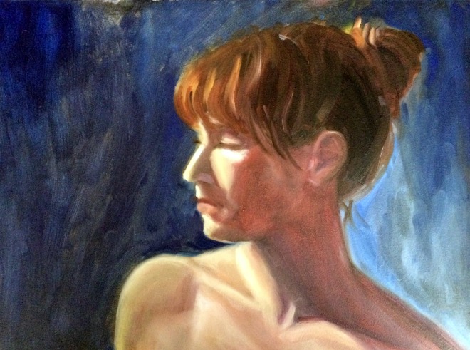
So much has been going on that I'm having to put painting on the back burner for now. But I did get to go to a live model session last Friday - this was the result. I absolutely loved the lighting and the working from her profile - it made it seem very dramatic to me.
I am thinking I won't have much time to paint until the Christmas Holidays, so I'm looking forward to that!
Birdies
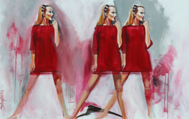
Not sure if I'm finished with this yet, but I am having fun with this one. I combined my love of abstract with my love of portrait and figurative work - combined with my current obsession for red and just a little Warhol thrown in for fun - with the repeating figures.
I was actually trying to find a crowd pic but couldn't find one so I thought why don't I just make multiple copies of this model? I thought the crisscrossing legs would be cool... not sure it turned out that way though.
It's surprisingly hard to paint exact copies. You can see there are a lot of differences between them. It was easier to get the two models side by side but the one off to the left is way off. I plan to do this kind of painting again and see how close I can come to making exact replicas. I don't ever trace things but I might reconsider that - paint the first one and then duplicate it with tracing paper. Tracing has always seemed like cheating to me - although a lot of artists I really respect do some tracing. I might consider it only if I'm tracing the first model I paint. That way I'm tracing my own work.
This is in acrylic and I'm actually really starting to like working with it. It dries so frigging fast! I mean like almost after I put the paint on the canvas. And then it's forgiving... I can paint over things as often as I'd like and can completely cover black with just one or two coats. With oil I can push the paint around but I can't cover mistakes like that unless I wait for it to dry. So I'm liking that aspect.
I also love making drips. Sorry that might sound childish but hey ... the drips bring out the inner kid in me.
There are a lot of things unfinished in this painting, but I think I like it that way. At least I like it today... tomorrow ... who knows?
See if you can figure out why I called it Birdies. Haha
Royals
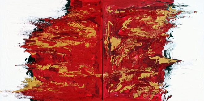
I hung these two abstracts at Market Central today. They are 24"x24" canvases gallery wrapped and then coated with clear resin.
They were really fun to do, and finishing them with clear resin really made a difference. I like it that they could be hung any number of ways - both pointed up, pointed down, white together or red together. They were an experiment and I used a lot of paint making them. I really like the way they turned out!
Cry, Cry Baby
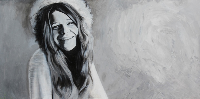
Painted this over the weekend. It's large for me - on a 24"x48" gallery wrapped canvas.
I did it in acrylic because I didn't have time for oil paint to dry. I wanted to get some work out to Market Central because my artist friend Glenda Brown and I are sharing a wall.
Janice Joplin is incredibly hard to capture. Her looks and even her features seem to change from picture to picture... so I just focused on the picture I was working from.
Acrylic is also a challenge for me because I don't use it very often. I was really impressed with the masterson palette I used, because over the course of the three days I was working on it, the paint didn't dry out. That was really impressive. But working with the acrylic seems sluggish. The paint gets sticky so fast there's no time to blend your colors on the canvas. I used a gel medium with the paint to try to keep it pliable but it still dried too quickly. I do believe there are some mediums on the market I can get to slow down the drying time - I might look into that. I just need the paint to stay workable for long enough to blend. It may have also been that I wasn't using enough water while painting. On the flip side, the whole reason I used acrylics was for the fast drying time. So I guess you can't have it all!
I was encouraged with this portrait because my husband liked it so much, he actually wanted to keep it!
Royal
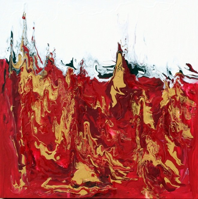
This abstract was an experiment - I was playing around. On reflection, I think red is a very strong color that seems to invoke a dramatic response. It seems like when I attempt non representational abstract expressionism my abstracts seem to have a violent nature - like they are shouting at me. On the bright side, at least my work is evoking an emotion. So I am wondering if the work that disturbs me the most, might also be my best work?
Paint your own Abstract!
Lisa Balton and I put on a "Paint your own Abstract" painting party at the Fountain Gallery yesterday. It was a wonderful success! The participants all brought their own canvases and an idea of what they wanted to paint - we supplied paint, brushes, and a little guidance - mainly helping them mix the right colors and achieve the result they were looking for.
So proud of them! Their paintings were fantastic!
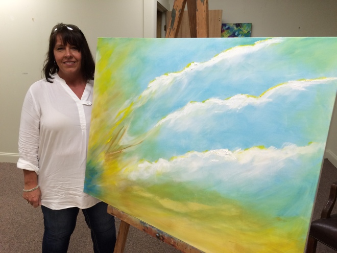
Leah did a non representational abstract that she conceived!
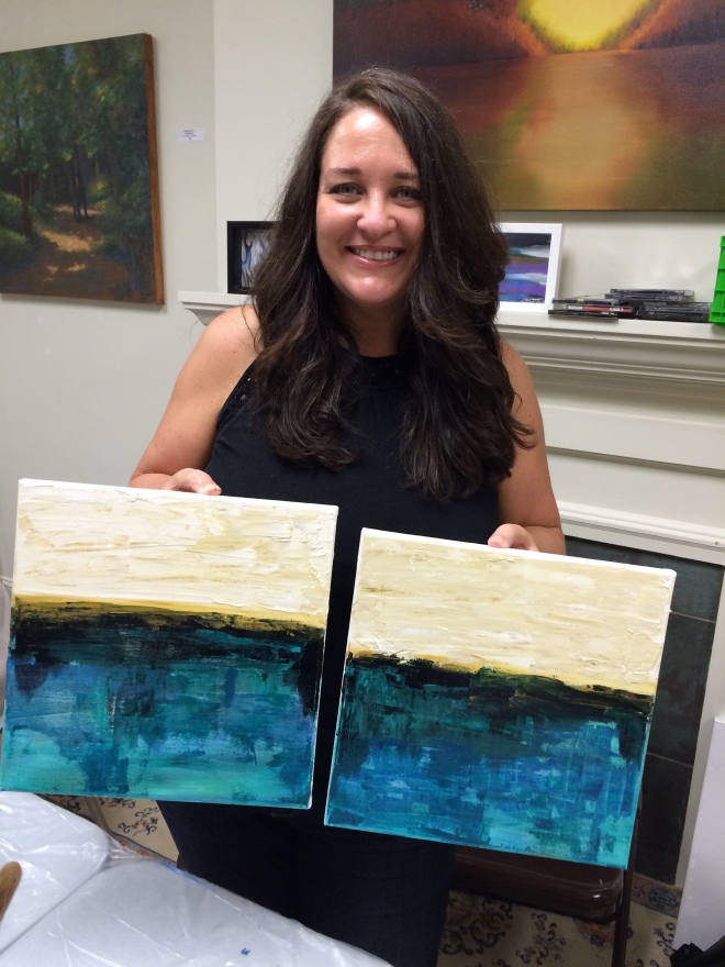
Kristi did two 12x12 paintings working from a picture but changing the colors - great palette knife texture!
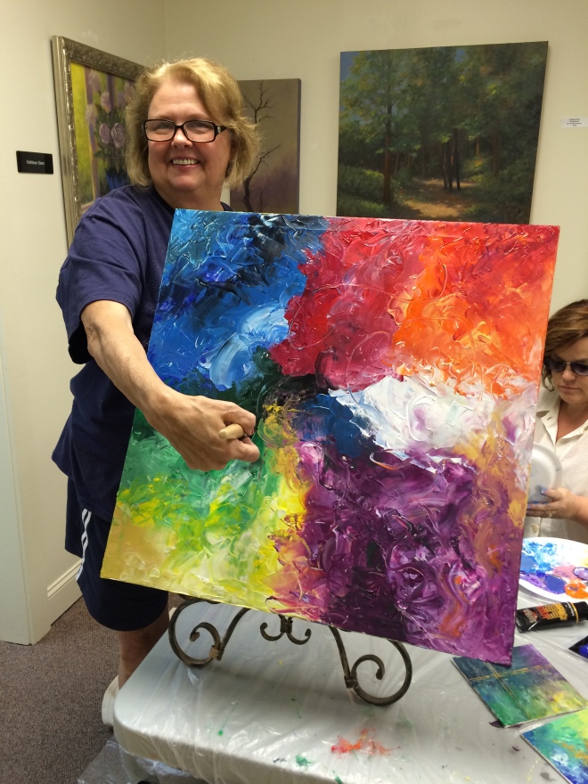
Nancy was another creative girl who came up with her concept!
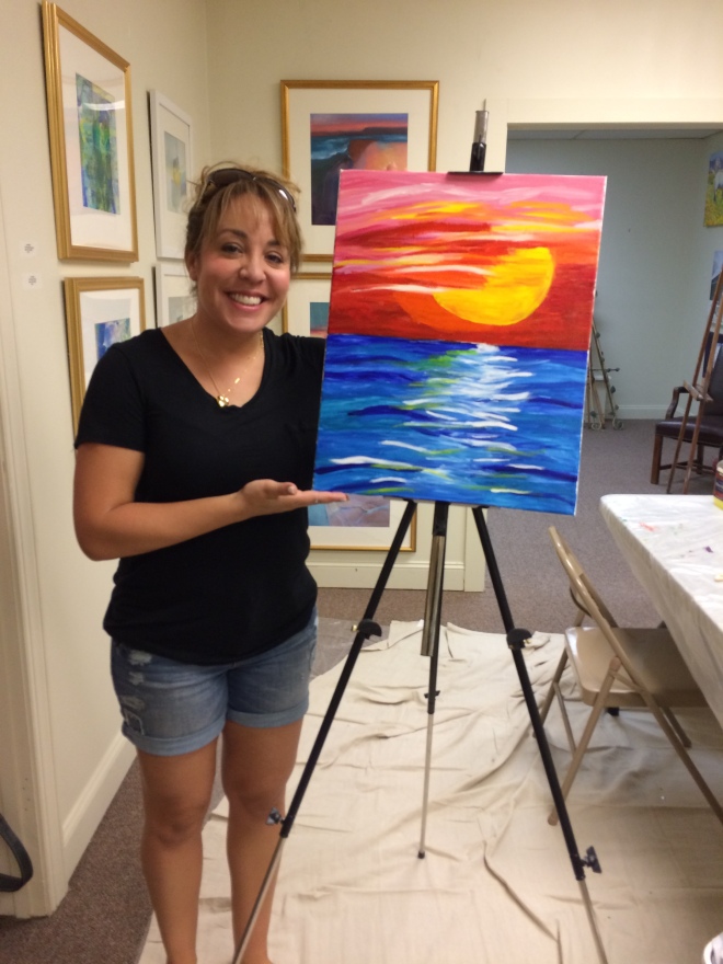
Charlene did a great job with this abstract landscape of a sunset over water!
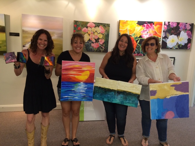
Here are the dance girls - Michelle (far right) did a beautiful job - love the colors she used!
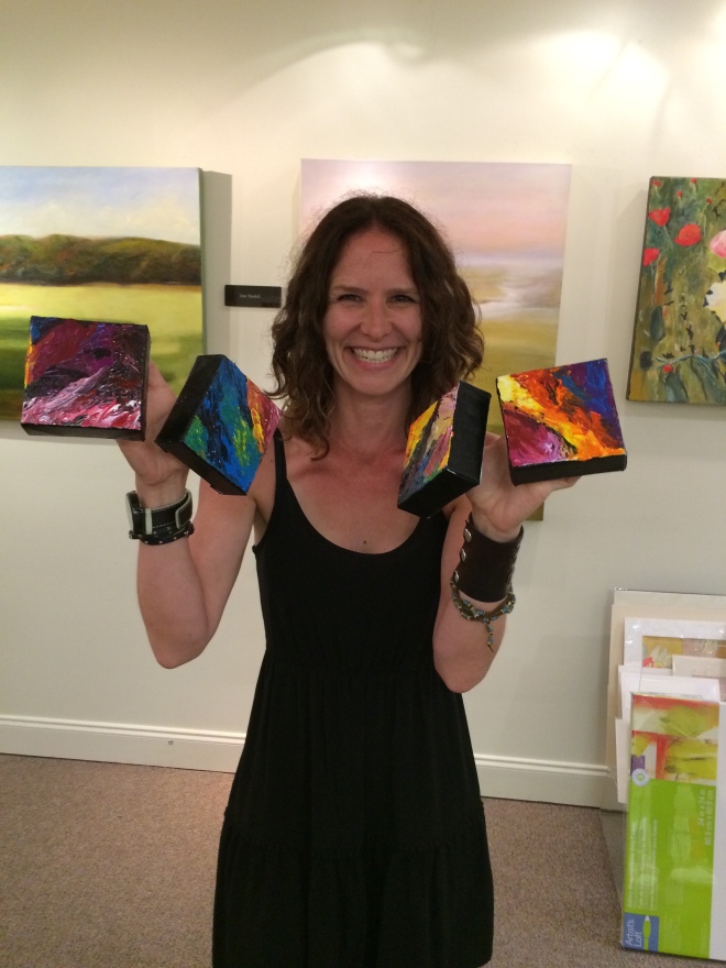
Our other Michelle in the group did the cutest little squares - her use of color and texture on these was fantastic!

Leah did a non representational abstract that she conceived!

Kristi did two 12x12 paintings working from a picture but changing the colors - great palette knife texture!

Nancy was another creative girl who came up with her concept!

Charlene did a great job with this abstract landscape of a sunset over water!

Here are the dance girls - Michelle (far right) did a beautiful job - love the colors she used!

Our other Michelle in the group did the cutest little squares - her use of color and texture on these was fantastic!
Little Bursts of Color and Market Central
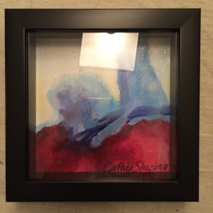
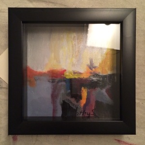
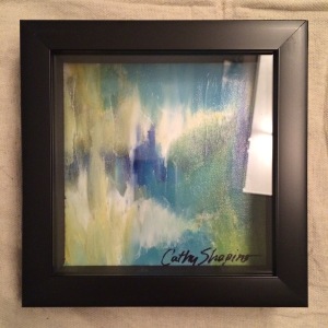
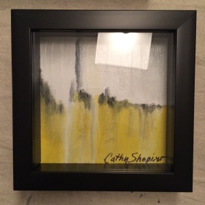
What a crazy week it's been! Sorry the lighting is so bad on these. These are little 6x6 abstract studies I was working on for our "Paint your own abstract" party at the Fountain Gallery this weekend. Right now they are on sale at the sidewalk sale at Market Central!
On Tuesday, I find out there's an opportunity to display some work at Market Central for this weekend's big Sidewalk Sale, so I spent most of yesterday getting ready for that. Artist Glenda Brown is sharing a wall with me, and we had to paint the wall, and hang some art.
I didn't have anything ready that I thought would work for the designer crowd that shops there except one abstract. So the one abstract (red and blue one I call "Eruption") is mine - the rest are Glenda's. Glenda is a fantastic portrait artist, and I've gotten to know her through Anne Enoch's Wednesday night painting from life group.
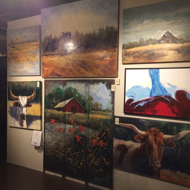
So I'm excited to now be at Market Central, and will devote some time to putting together more art for this wall!!!
Faces from You Tube
Driven to Abstraction!
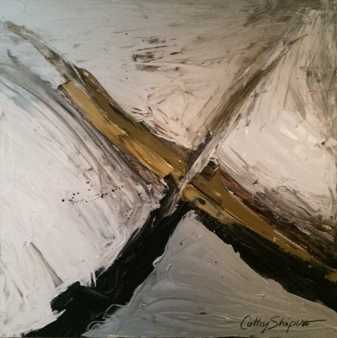
It's been so long since I posted! Crazy busy lately! I have been productive and have been painting, just not posting... haha!
I put a few hanging systems around the house. One in my office so I could get my paintings off the ground, and another in the kitchen. We have a very modern kitchen and so I painted a couple of abstracts that seemed to suit the room. ;)
This one was my fav of the two. Here's the other:
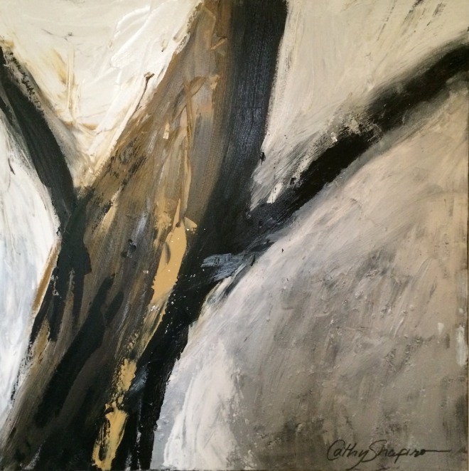
I plan to put a clear coat of epoxy resin on them. It will be an experiment since I've never done it before. I've ordered the stuff but it won't be here until the 18th so will have to wait a while.
Happy painting!
Jack White
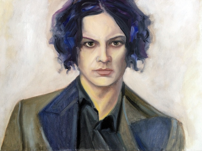 It's extremely liberating to just paint what I want to paint! I was out of town for three weeks, and now I need to get some things painted for The Fountain Gallery.
I've had this picture saved for a while now - and painted it today. I have a terrible summer cold and so didn't feel like doing much - so painting was relaxing.
My son didn't know who this was! I must have done a terrible job getting his likeness! In case you also don't know, it's supposed to be Jack White. I went a little crazy with his hair - the colors were just talking to me. Maybe I inhaled a bit too much paint thinner but I am really loving his hair! Haha
27 Club
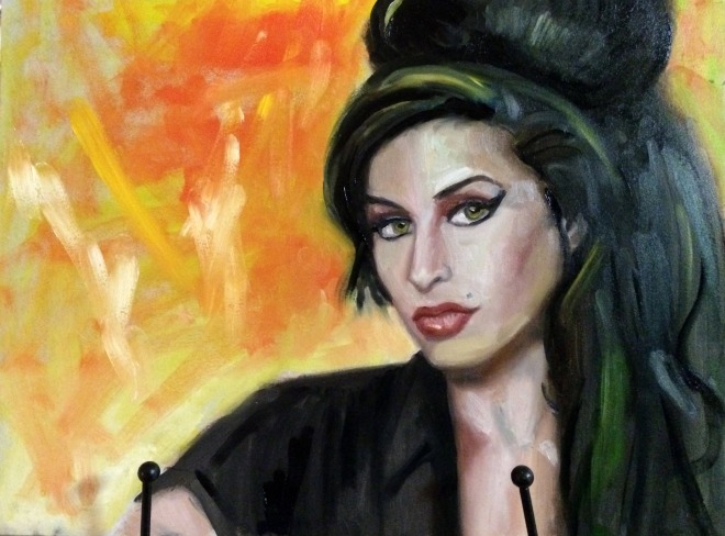 I have been traveling a great deal this month, and so I miss painting! Tonight I had to paint something - anything! So I found a picture online of Amy Winehouse.
I can tell I'm rusty. There are a few things that may be wrong here:
- I used bright colors
- She looks too much like Elvira
- I made her prettier (subconsciously I think)
Sea of Cortez
Cerritos Beach and Cat Monster
Cabo San Lucas
Male Nude Model
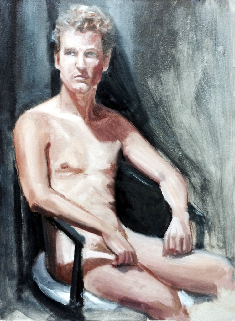
If you're coming from Facebook - made ya look!! Haha!! The truth is I planned it this way so there is a suggestion of nudity. It really shouldn't be offensive to anyone.
I've been traveling and working a lot so I haven't had time to paint, and I miss it so very much! This morning I was able to go to the Friday paint group and get this done. So happy to be painting. This was the first time I've painted a male nude - I was pretty happy with what I was able to get done in 3 hours. I will be traveling a lot more over the next three weeks so I'm not sure if I will find time to paint, but I hope so!
Bikini Line
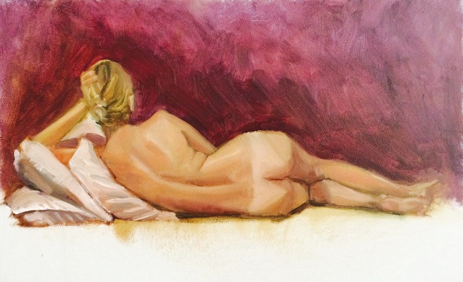
Painting from life at Nysha Studio in Bartlett this morning.
We had a great model! Beautiful girl. And it was a great group of artists - Sue Foell, Holly Wolfe, Terry Kenney, Jenny Miller, Tim Minshew, and Nysha.
I really enjoyed this pose. I think the back is so beautiful. The skin tones were so varied with her tan lines and the lighting - making for an interesting study! So that's why I'm calling it "Bikini Line!" Haha It's a 12"x16" Oil on Board.
When is a painting finished?
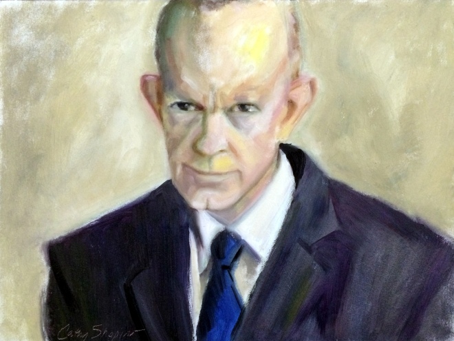
One of the hardest things for me (besides choosing a subject to paint) is to know when it's finished. I started to correct my mistakes - but after a few little brushstrokes decided that I like it just the way it is.
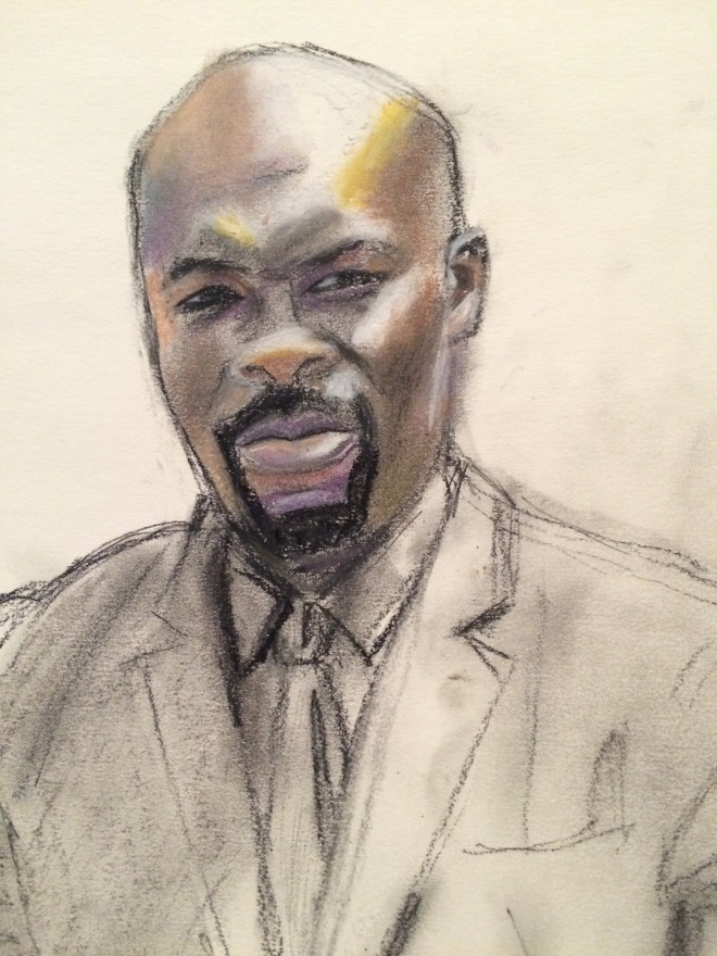
If I were to do more I feel like I would overwork it - and perhaps ruin it. So here's my final portrait of Mark Landis.
By the way, they posted the portrait on the Art & Craft Facebook page. You can see it here:
https://www.facebook.com/artandcraftfilm?fref=nf
Art & Craft
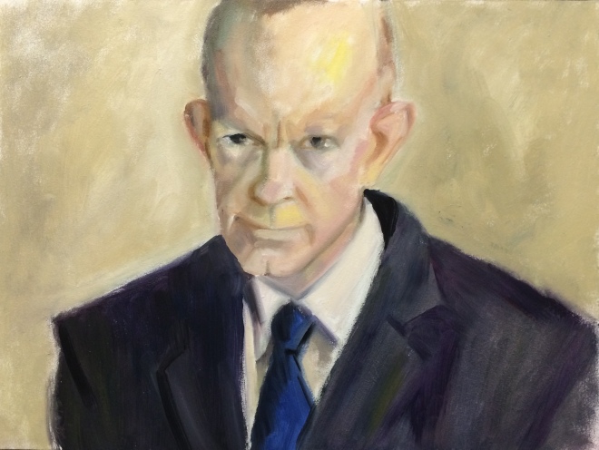
I watched the best documentary I've seen in a while the other night.
It's called "Art & Craft" and it explores the forgeries of Laurel, Mississippi native Mark Landis.
Landis' crime was (in my opinion) fairly harmless because he didn't profit from any of his forgeries - he was being a philanthropist.
The thing is... the guy is really a great artist.
Anyway, I did this really - really quickly tonight. Just basically throwing the paint on the canvas. I plan to refine it more - I see about a hundred things I need to change. But I wanted to post a before, so I can gauge the "after"!
By the way, I'm planning to send this to him.
Mother's Day Card
I feel like I've been on a painting marathon! Haha! The deadline to enter the MGAL National Show is today and of course I leave everything to the very last minute!
I started this yesterday. It's pretty large - on a 24x36 canvas and although I would have liked more time to work on it, I'm pretty happy with it. Cross your fingers that it gets in the show!
Plein Air Memphis!
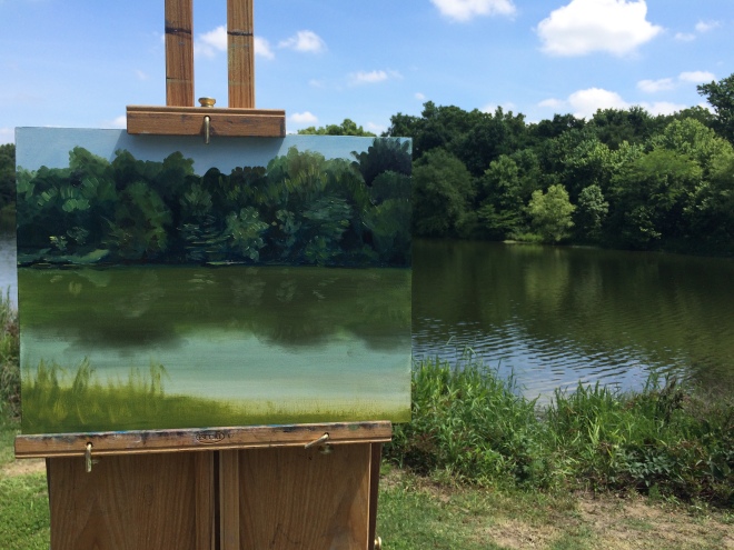
I had such a good time this morning painting with Plein Air Memphis. We got together at the Wolf River and spend about 2 and half hours painting. Afterwards we met up and got a group photo. Such great artists - they are an inspiration to me!
So this is my effort from today. For the most part I was happy with the values. So much green! So many variations of green! I used a limited palette simply because I was too lazy (or maybe too hot) to get some more. So I was proud of myself for achieving these colors with just ultramarine, viridian, cad yellow light, cad red light, black, and white.
This is my third time going on a paint out, and I can tell I'm getting a bit better. Trees are so incredibly hard to paint!
Tag :
alla prima,
daily painting,
drawing,
landscape,
memphisart,
mgal,
painting a day,
plein air,
sketch,
The Ring
Always love painting from life group on Wednesday nights! This was our model. She is getting married in two weeks so I don't know how she fit this in!
I had a difficult time painting her but I was really proud of the pillow! Haha!
Ten Years
Painting from Life
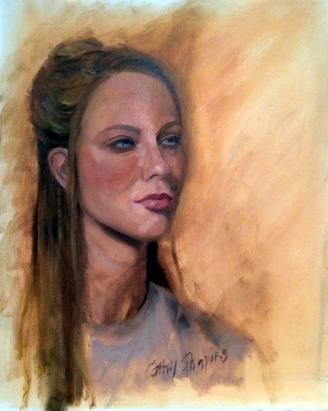
We had another drop dead gorgeous model in painting from life group tonight. Anne is on a roll! She had beautiful features - full lips, long neck, bright blue eyes.
I think I am bringing too large of a canvas to the group because I tend to paint a little larger than life, which I really don't like.
All in all, I was semi-happy with this one. Half way through I messed up all the edges like I've seen Sue Foell do so often. It seemed to help because my painting was too controlled up until then.
There just isn’t enough time to do everything I would like in 2 and a half hours!
Learning to Stretch Canvas
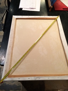 I stretched a fairly large canvas for the first time tonight. It's 22"x28".
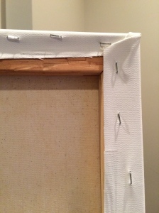
My friend Jamie McMahan (absolutely fabulous portrait artist) shared a tip with me to get the stretchers square. He showed me you measure from corner to corner on one side, and then make it equal on the other side.
When I first put the stretchers together, I thought it looked square. After measuring both corners, I discovered I was a whole inch off! Measuring did the trick! After I put the canvas on, I put it in the frame and it fits perfectly!
I made the mistake of being too stingy with the canvas. In other words, I didn't cut enough to give myself room to really use the pliers on the canvas. As a result I stretched tight on the side that had enough room, and not tight enough on the sides without enough canvas so it was lumpy. So here's another trick. I just put some water on the back side of the canvas and being cotton - it shrunk and straightened out my canvas.
My corners are horrendous though! I will have to practice on them much more! Oh, and just one more tip - I use an electric stapler - so much easier on the hands!
Tag :
stretching canvas,
Sketch
I don't do enough pencil sketches these days. I usually just jump right into painting without doing any drawing. I did this quickly today, and enjoyed working with a different medium so much!
It's a study for a larger painting I plan to do.
Musings
I'm not sure if you can tell but I did a little more on my Carnival of Venice piece. My husband said it looked like a Geisha girl in Venice - my son said the mask was not evident. Everyone's an art critic around here!
So I worked on it a little more. I'm not sure that it's any better and I may work on it more.
Last night went to live painting group but I was really not having a good night and that was a real shame because we had a beautiful model. I had been up since 5:30 and I think I was just tired.
Here's my unfinished piece that I am very unhappy with!
I'm breaking a new rule here. I was listening to a podcast on savvypainter.com with Carole Marine and she talked about how important it is not to post your bad paintings. I'm not sure if that really applies to me yet because I'm not selling my work - still very much in the learning stages, but it sure sounded like a good idea.
Masquerade
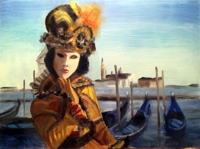
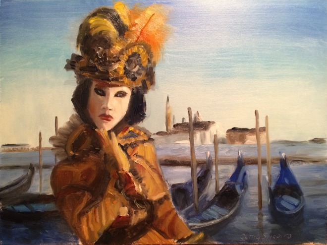 I am such a weirdo! Haha! I wanted to do a quick painting tonight and was just so fascinated with the Carnival of Venice pictures I found online that I did this.
It's surprisingly hard to do a blue sky, and blue water, and blue boats. They were all different shades of blue. The sky graduated from an ultramarine to a cerulean to an almost yellowish light blue. As you can see ,I didn't spend a lot of time on them.
But the thing that just absolutely fascinated me was the figure in that mask! I don't know if you can actually tell it's supposed to be a mask.... but that was what I was shooting for!
Search for Dark Flesh Tones
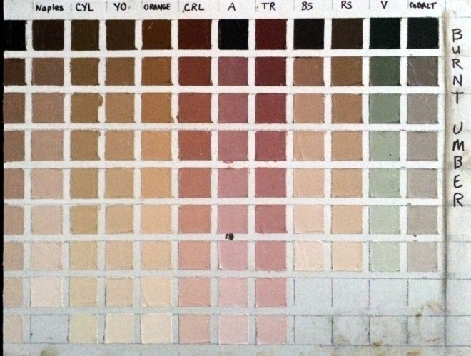
I'm almost ashamed to post this picture - it's so messy! Yesterday to prevent my hand from cramping, I approached my color chart slowly - only doing a couple of rows at a time and then taking a break. That helped and my hand and wrist survive!
My goal was to find the right flesh tones for an African American girl that I plan to paint. So the color I started with was Burnt Umber.
Here's what I learned:
First I didn't mention in the last post that doing these exercises uses up a LOT of white! I'm using Titanium White.
Another thing I didn't mention is that I'm using the paints I use all the time - in my case they are Rembrandt brand, and it's important to use them because other brands have different tinting strengths and so my charts wouldn't be accurate if I used a different brand of paint on them.
The colors I used on this chart were: Naples Yellow, Cad Yellow Light, Yellow Ochre, Cad Red Light, Alizarin, Terra Rosa, Burnt Sienna, Raw Sienna, Viridian, and Cobalt.
While I was looking for really dark flesh tones, surprisingly I found that Burnt Umber can make some fantastic caucasian skin tones too. Especially the lighter ranges of Burnt Umber mixed with Naples, mixed with Yellow Ochre, and mixed with Burnt Sienna. Even just plain ole burnt umber mixed with white makes a nice neutral caucasian skin tone.
I found that Viridian must have more tinting strength than Burnt Umber because it overpowers it and the mixture turns out green. On the other hand Burnt Sienna seemingly has weak tinting strength.
Burnt Umber mixed with Cobalt gives you a fantastic very slightly greenish gray. I don't know about you, but for me it's very hard to find an easy way to mix a lively gray, so that's very useful to me.
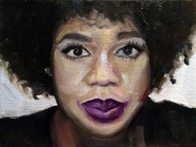
Here's a picture of the girl I'm planning to paint.
From my exercise, I think the color that most closely represents her mid range skin tone is the two darkest versions of burnt umber mixed with raw sienna. The highlights seem to almost go a warm yellowish orange, and so for the highlights I will try the third color down of burnt umber mixed with orange. Then for the darkest dark on the right side of her face, it looks almost dark purple to me ... so there I will use the darkest value of burnt umber mixed with alizarin.
It will be exciting to see how the painting turns out. I've never done a color study "before" painting a portrait, so wish me luck.
Terra Rosa Torture!
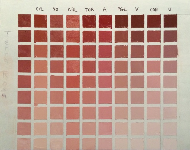
Every major artist's book recommends the fledgling artist do their color charts. So I thought, "How hard could that be?" And today my mission was to knock out several of them. Boy was I in for a surprise!
First I went to four stores trying to find half inch or quarter inch masking tape. No luck at Lowe's, Walmart, Office Depot, or the craft store. So finally I end up buying green floral tape at the craft store cause it's the only tape I can find that's small enough (quarter inch). I also had trouble finding a T square - finally found one at the craft store.
Then I prepare the canvas. That took forever! Measuring and laying down the tape. But by this time I'm still happy go lucky - moving along - having a good attitude.
I start painting the squares - using my favorite color first - terra rosa. And I start off using a brush. Big mistake! Unless I plan to completely clean my brush each time, the color is just running together. I couldn't wipe off enough paint with a paper towel to make a clean stroke. So I turn to the palette knife. Now, I've never used one before, and I have to say it was absolute torture! As I type this my fingers and wrist are in pain. I'm not usually one to complain but half way through the messy ordeal, I was in agony. I couldn't make a smooth stroke, I couldn't get the darn thing into the square corners. Complete fail!
I realize that I do need to do my color charts. It's a rite of passage, a necessary evil. I realize doing them will help me, and make me grow as an artist. And it's not the color chart or mixing the color that bothers me - it was the darn palette knife!
Ok, enough ranting - off to find the alleve!
Post Notes:
I forgot to include how I made this chart. The first column is the pure color, and the successive blocks down the column show the color mixed with equal parts of white. Then in the remaining columns, the first block is the pure color (in this case terra rose) mixed with an equal part of another color. I am using Cadmium Yellow Light, Yellow Ochre, Cadmium Red Light, Transparent Oxide Red, Alizarin, Permanent Green Light, Viridian, Cobalt, and Ultramarine. Then down the columns, in the successive blocks each new color is mixed with an equal part of white. Hope that explains how I made it.
Things I learned from this exercise:
It's extremely messy!
You can't use a brush - this is really best suited for the palette knife. And that makes me wonder about my alla prima sessions - I probably need to use more brushes or clean them more often to get clean color.
How the addition of white changes the mixtures.
How the colors appear most vivid in the mid range.
Looking at the chart, the flesh tones that appeal to me the most are Terra Rosa mixed with Cad Yellow Light and Terra Rosa mixed with Permanent Green Light. They would make excellent caucasian flesh tones. I'm surprised at how the mixture turned out with Cad Yellow Light - it's not orange at all so that makes me think that Terra Rosa must have some blue or green in it to begin with.
Terra Rosa mixed with Cad Red Light would make good warm shadows for the ears, cheeks, and mouth, while Terra Rosa mixed with Alizarin would make great cool reds in those same areas.
Terra Rosa mixed with Ultramarine or mixed with Viridian makes really nice cool shadows for use under the chin in the neck area or receding planes on the forehead.
As I mentioned Terra Rosa is one of my favorite colors - but it's a recent addition to my palette. I have googled it but can't find the mixture to know how Terra Rosa is made. If anyone knows the color recipe please share with me!
Painting from Life
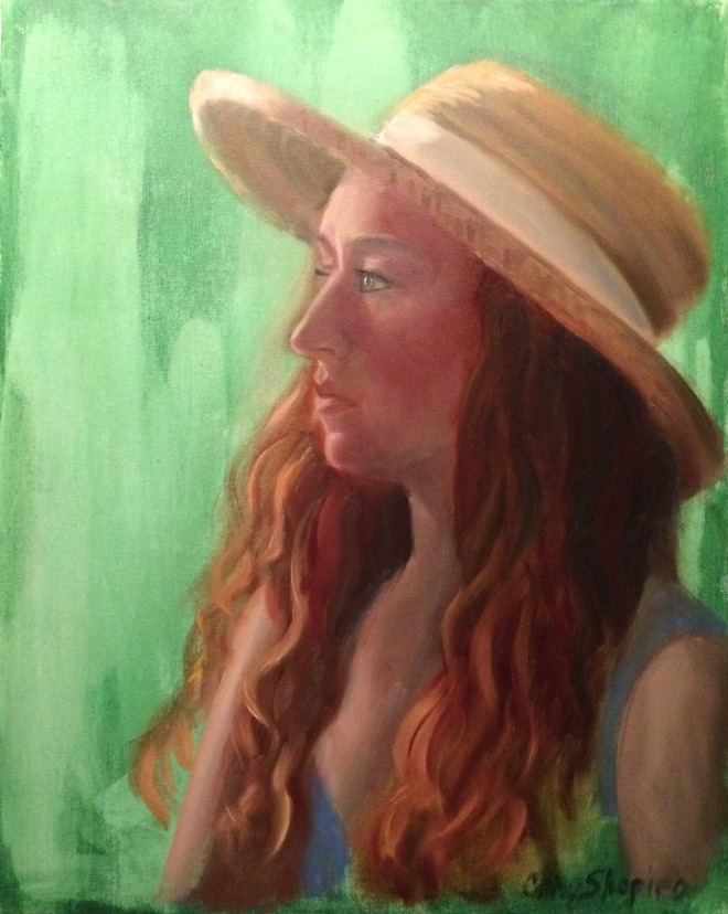 I was needing some serious redemption after my latest "attempts" at painting, so tonight I thought I would try to paint something nice at our life painting group. My friend's daughter was the model, so I guess I just stacked up too much pressure to perform on myself!
The group was packed so I ended up in the corner, so didn't have a good angle. I think I captured her likeness somewhat, but I also think I was a bit tired of painting after painting the two roses earlier. So I'm hoping she will model for the group again, because I would like another shot at painting that beautiful red hair!
Life Painting
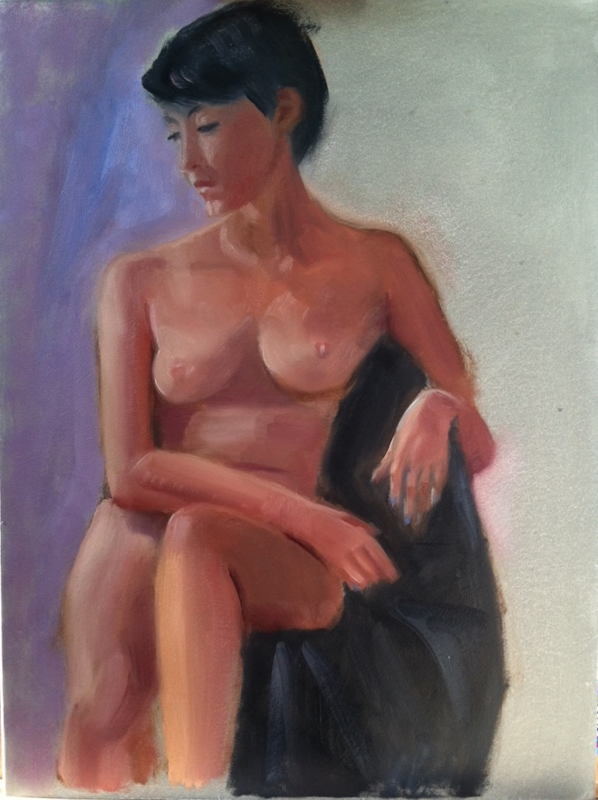
Our live painting group has nudes occasionally. This was my painting from last night. Especially where I live, people don't seem to have very much of an open mind about nudes - they think they are obscene. It seems like every art exhibit I've applied to be in, I'm told "no nudes."
I think the human body is a work of art, and is beautiful - no matter the shape, or age, or size. I also have observed that every true art gallery has nude statues and paintings. But here in Memphis, even the gallery owners admit they have to consign the nudes to a back room. So it appears that people in the Renaissance were much more open minded than we are today! It's a shame, and I guess I will continue to be a "rebel."
MGAL Spring Exhibit
Delta Blues
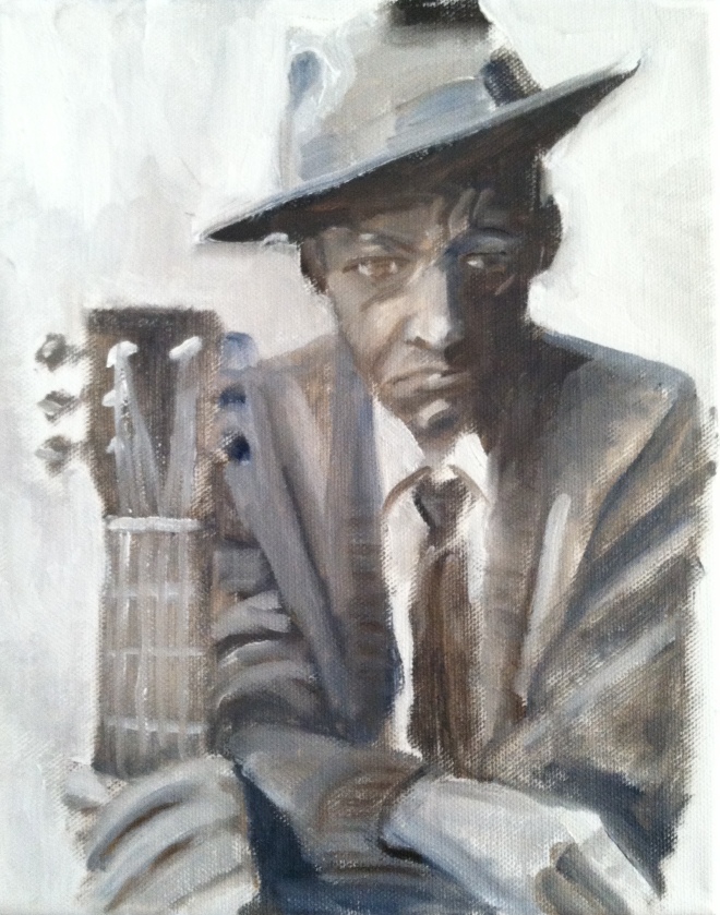 Ok so a winery here is having a label contest, and the name of the winery is "Delta Blues." A friend of mine asked me to enter the contest today, so I did this real quick. Seriously quick - like less than an hour and it probably shows! Haha. But there is something about the rough painting of this man that I really like. I like things not being so controlled and perfect.
 Painting from Life
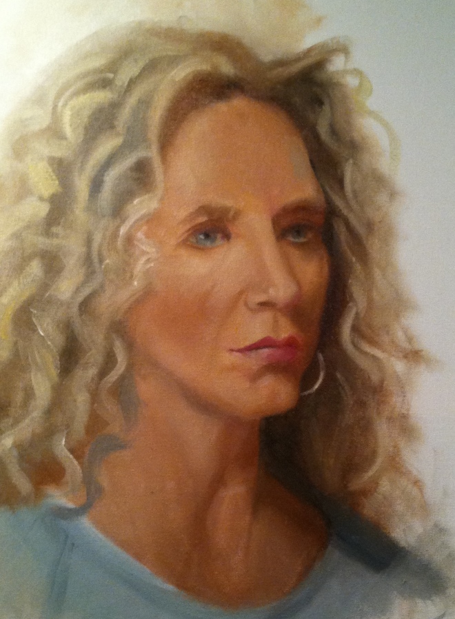 Did this last night in painting from life class. Again, I didn't measure. I don't know why I refuse to do that. I was also too lazy to refresh my paints so they were kind of sticky. I ended up making the head a little larger than life size, so was unhappy with that. But I was happy with achieving a semi semblance of curly hair - and thought I got the likeness pretty close. ;)
 Painting from Life
Red Acetate
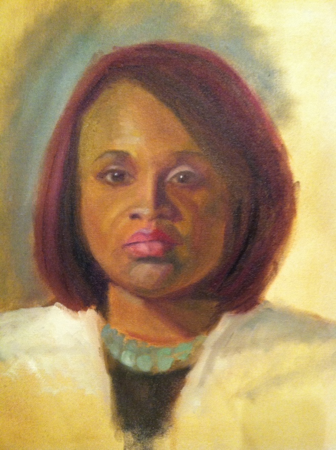
Ann Enoch (who hosts our life painting group in her studio) gave me the absolute coolest thing tonight! A red acetate frame! She was sitting next to me, and I commented on how nice and glassy she made the models eyes and Anne looked at my painting and she immediately recognized the problem - my highlights weren't bright enough! She gave me the red acetate frame to look through to help judge my values. I was blown away by how much it helped. Before using it, my painting looked so flat - there was no life in it. Using the acetate I saw that I wasn't making my highlights light enough!
Love this group! I learn so much from them!
As for the painting - I really liked it while I was there but I think subconsciously I knew I needed to work on her mouth more. In particular the right side that is in shadow is too bright red - I should have toned it down with some green or made it more purple. Also her mouth was not as crooked as I made it in the painting. To be honest with myself, I was thinking that the crook in her mouth gave her character - when in actuality her mouth was much straighter. I need to quit adding things that aren't there and stick to painting what really IS there. But on the other hand ... hmmm... there IS no other hand!
