Over Three years!

I have taken quite the hiatus from painting. But I guess if you love something you will always come back to it.
I started easing back into it by starting an online course with Dennis Perrin on painting the flower portrait. The past couple of days I've painted some rather past their prime pink roses in a blue mason jar.
This is day one - "Having a Ball" will post day two next.
The Back
Happy to get back in the studio tonight. Painted this at Anne's tonight and am planning on painting again on Friday. It's been too long!
Dramatic Light

So much has been going on that I'm having to put painting on the back burner for now. But I did get to go to a live model session last Friday - this was the result. I absolutely loved the lighting and the working from her profile - it made it seem very dramatic to me.
I am thinking I won't have much time to paint until the Christmas Holidays, so I'm looking forward to that!
Royals

I hung these two abstracts at Market Central today. They are 24"x24" canvases gallery wrapped and then coated with clear resin.
They were really fun to do, and finishing them with clear resin really made a difference. I like it that they could be hung any number of ways - both pointed up, pointed down, white together or red together. They were an experiment and I used a lot of paint making them. I really like the way they turned out!
Faces from You Tube
 I
I'm having a bit of a painting problem lately where I can't seem to find a subject that holds my interest. So I started looking on you tube and found a ton of interesting faces. This one in particular stood out to me. Love her full purple lips!
I
I'm having a bit of a painting problem lately where I can't seem to find a subject that holds my interest. So I started looking on you tube and found a ton of interesting faces. This one in particular stood out to me. Love her full purple lips!Driven to Abstraction!

It's been so long since I posted! Crazy busy lately! I have been productive and have been painting, just not posting... haha!
I put a few hanging systems around the house. One in my office so I could get my paintings off the ground, and another in the kitchen. We have a very modern kitchen and so I painted a couple of abstracts that seemed to suit the room. ;)
This one was my fav of the two. Here's the other:

I plan to put a clear coat of epoxy resin on them. It will be an experiment since I've never done it before. I've ordered the stuff but it won't be here until the 18th so will have to wait a while.
Happy painting!
Jack White
 It's extremely liberating to just paint what I want to paint! I was out of town for three weeks, and now I need to get some things painted for The Fountain Gallery.
I've had this picture saved for a while now - and painted it today. I have a terrible summer cold and so didn't feel like doing much - so painting was relaxing.
My son didn't know who this was! I must have done a terrible job getting his likeness! In case you also don't know, it's supposed to be Jack White. I went a little crazy with his hair - the colors were just talking to me. Maybe I inhaled a bit too much paint thinner but I am really loving his hair! Haha
Plein Air Memphis!

I had such a good time this morning painting with Plein Air Memphis. We got together at the Wolf River and spend about 2 and half hours painting. Afterwards we met up and got a group photo. Such great artists - they are an inspiration to me!
So this is my effort from today. For the most part I was happy with the values. So much green! So many variations of green! I used a limited palette simply because I was too lazy (or maybe too hot) to get some more. So I was proud of myself for achieving these colors with just ultramarine, viridian, cad yellow light, cad red light, black, and white.
This is my third time going on a paint out, and I can tell I'm getting a bit better. Trees are so incredibly hard to paint!
Tag :
alla prima,
daily painting,
drawing,
landscape,
memphisart,
mgal,
painting a day,
plein air,
sketch,
Ten Years
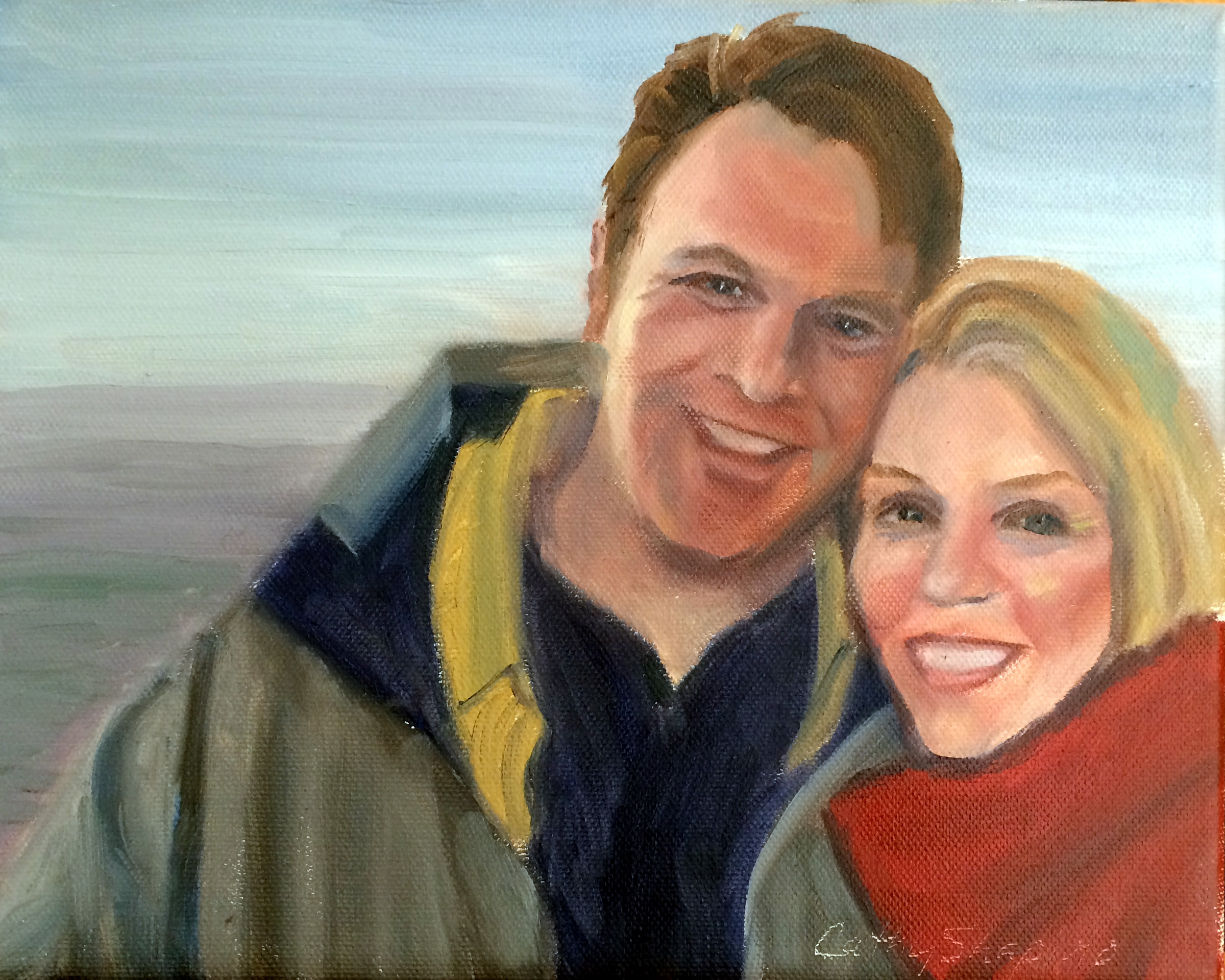
Yesterday I celebrated my ten year anniversary with this guy. So in celebration, I did a quick painting from this picture on our honeymoon.
I don't think I've attempted many self portraits, so it was a bit difficult to paint myself!
Painting from Life

We had another drop dead gorgeous model in painting from life group tonight. Anne is on a roll! She had beautiful features - full lips, long neck, bright blue eyes.
I think I am bringing too large of a canvas to the group because I tend to paint a little larger than life, which I really don't like.
All in all, I was semi-happy with this one. Half way through I messed up all the edges like I've seen Sue Foell do so often. It seemed to help because my painting was too controlled up until then.
There just isn’t enough time to do everything I would like in 2 and a half hours!
Sketch

Search for Dark Flesh Tones
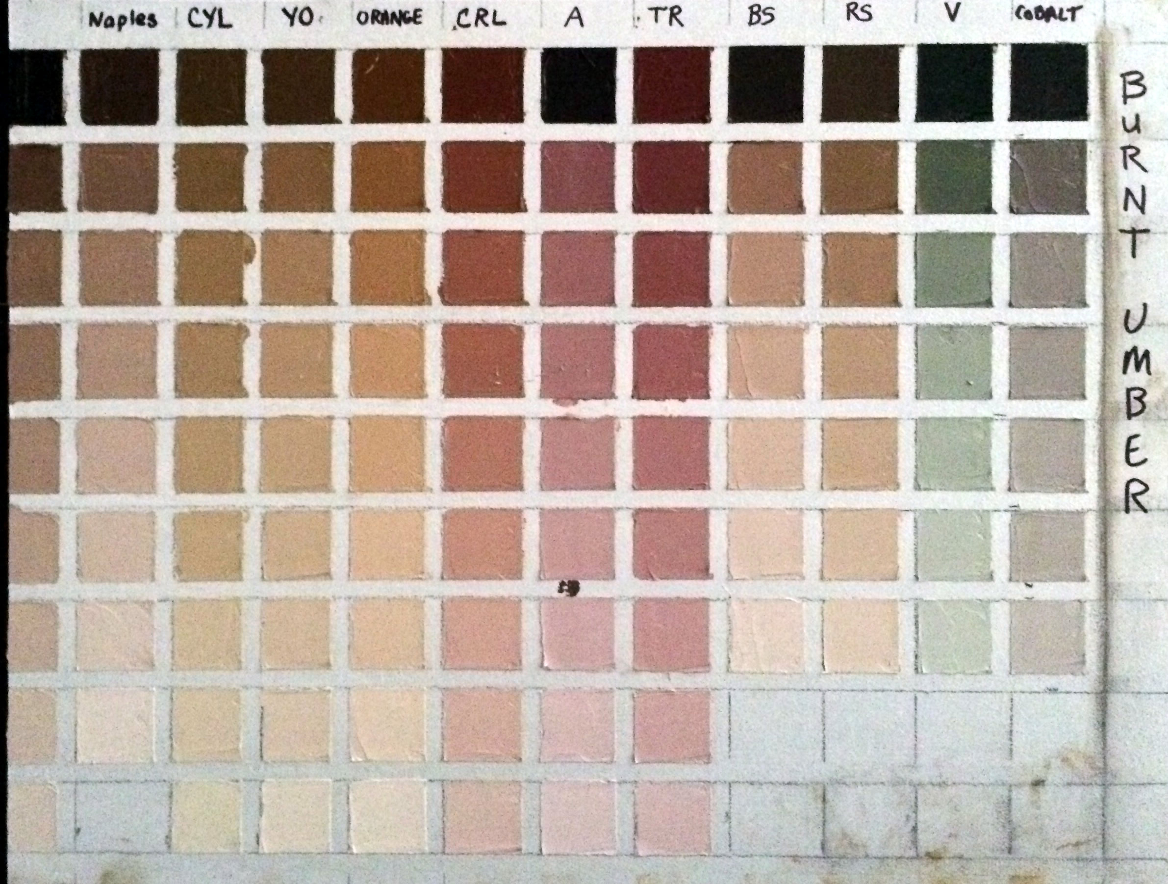
My goal was to find the right flesh tones for an African American girl that I plan to paint. So the color I started with was Burnt Umber.
Here's what I learned:
First I didn't mention in the last post that doing these exercises uses up a LOT of white! I'm using Titanium White.
Another thing I didn't mention is that I'm using the paints I use all the time - in my case they are Rembrandt brand, and it's important to use them because other brands have different tinting strengths and so my charts wouldn't be accurate if I used a different brand of paint on them.
The colors I used on this chart were: Naples Yellow, Cad Yellow Light, Yellow Ochre, Cad Red Light, Alizarin, Terra Rosa, Burnt Sienna, Raw Sienna, Viridian, and Cobalt.
While I was looking for really dark flesh tones, surprisingly I found that Burnt Umber can make some fantastic caucasian skin tones too. Especially the lighter ranges of Burnt Umber mixed with Naples, mixed with Yellow Ochre, and mixed with Burnt Sienna. Even just plain ole burnt umber mixed with white makes a nice neutral caucasian skin tone.
I found that Viridian must have more tinting strength than Burnt Umber because it overpowers it and the mixture turns out green. On the other hand Burnt Sienna seemingly has weak tinting strength.
Burnt Umber mixed with Cobalt gives you a fantastic very slightly greenish gray. I don't know about you, but for me it's very hard to find an easy way to mix a lively gray, so that's very useful to me.
Here's a picture of the girl I'm planning to paint.

From my exercise, I think the color that most closely represents her mid range skin tone is the two darkest versions of burnt umber mixed with raw sienna. The highlights seem to almost go a warm yellowish orange, and so for the highlights I will try the third color down of burnt umber mixed with orange. Then for the darkest dark on the right side of her face, it looks almost dark purple to me ... so there I will use the darkest value of burnt umber mixed with alizarin.
It will be exciting to see how the painting turns out. I've never done a color study "before" painting a portrait, so wish me luck.
Painting from Life
 I was needing some serious redemption after my latest "attempts" at painting, so tonight I thought I would try to paint something nice at our life painting group. My friend's daughter was the model, so I guess I just stacked up too much pressure to perform on myself!
The group was packed so I ended up in the corner, so didn't have a good angle. I think I captured her likeness somewhat, but I also think I was a bit tired of painting after painting the two roses earlier. So I'm hoping she will model for the group again, because I would like another shot at painting that beautiful red hair!
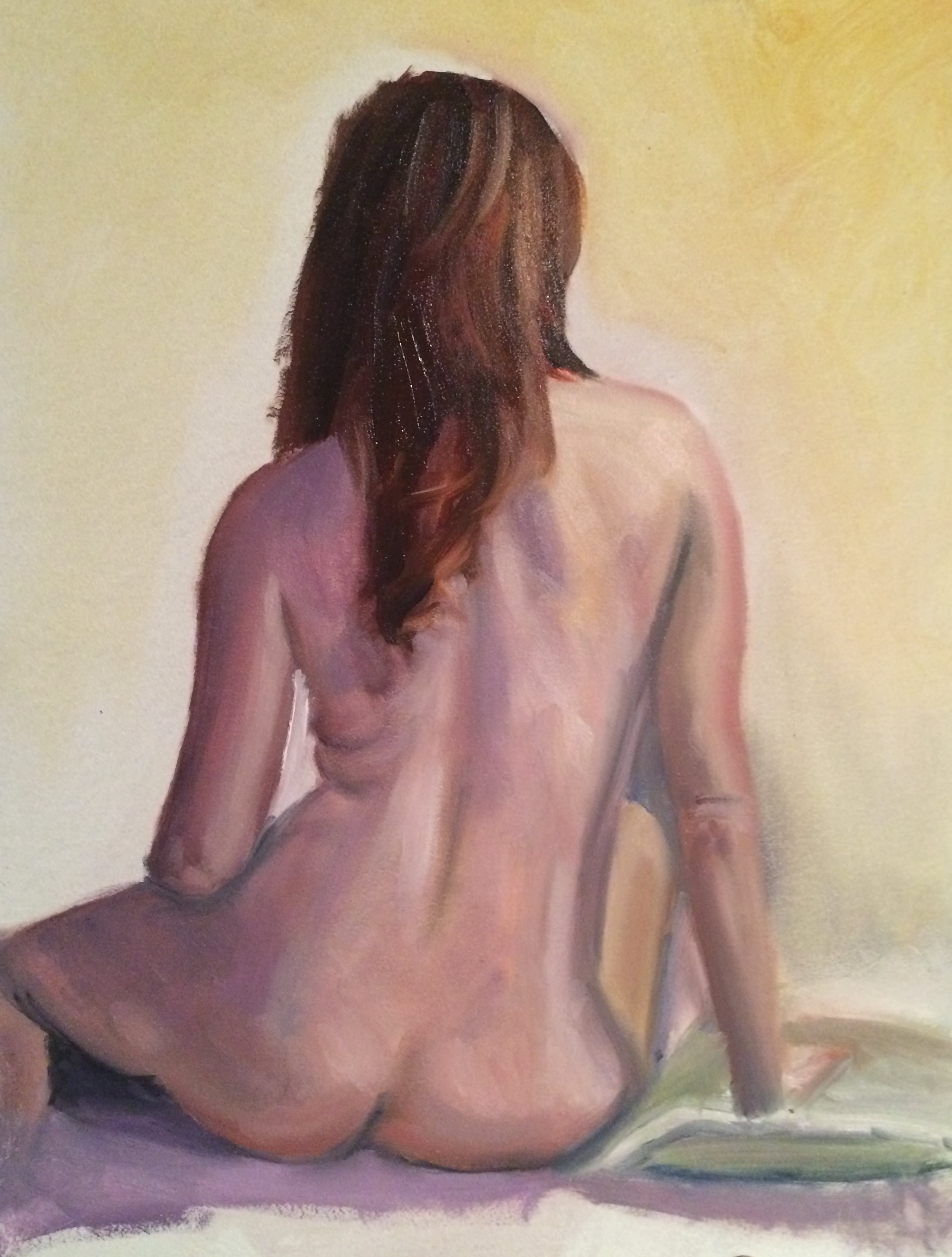
Life Painting

Our live painting group has nudes occasionally. This was my painting from last night. Especially where I live, people don't seem to have very much of an open mind about nudes - they think they are obscene. It seems like every art exhibit I've applied to be in, I'm told "no nudes."
I think the human body is a work of art, and is beautiful - no matter the shape, or age, or size. I also have observed that every true art gallery has nude statues and paintings. But here in Memphis, even the gallery owners admit they have to consign the nudes to a back room. So it appears that people in the Renaissance were much more open minded than we are today! It's a shame, and I guess I will continue to be a "rebel."
MGAL Spring Exhibit

So happy to be juried into the Memphis Germantown Art League's 2015 Spring Exhibit!! This is my very first juried exhibit! These paintings will be on display at the Germantown Center for the Performing Arts through May 27th. There is a reception next Saturday, May 9th from 4pm - 6pm
Delta Blues
 Ok so a winery here is having a label contest, and the name of the winery is "Delta Blues." A friend of mine asked me to enter the contest today, so I did this real quick. Seriously quick - like less than an hour and it probably shows! Haha. But there is something about the rough painting of this man that I really like. I like things not being so controlled and perfect.
 Painting from Life
 Did this last night in painting from life class. Again, I didn't measure. I don't know why I refuse to do that. I was also too lazy to refresh my paints so they were kind of sticky. I ended up making the head a little larger than life size, so was unhappy with that. But I was happy with achieving a semi semblance of curly hair - and thought I got the likeness pretty close. ;)
 Painting from Life
 A good friend of mine was the model for our painting from life group last night. Again, I did not measure well enough. I did not get her nose in the right position! On the flip side, I thought I got her eyes right and was semi-happy with the skin tones.
Red Acetate

Ann Enoch (who hosts our life painting group in her studio) gave me the absolute coolest thing tonight! A red acetate frame! She was sitting next to me, and I commented on how nice and glassy she made the models eyes and Anne looked at my painting and she immediately recognized the problem - my highlights weren't bright enough! She gave me the red acetate frame to look through to help judge my values. I was blown away by how much it helped. Before using it, my painting looked so flat - there was no life in it. Using the acetate I saw that I wasn't making my highlights light enough!
Love this group! I learn so much from them!
As for the painting - I really liked it while I was there but I think subconsciously I knew I needed to work on her mouth more. In particular the right side that is in shadow is too bright red - I should have toned it down with some green or made it more purple. Also her mouth was not as crooked as I made it in the painting. To be honest with myself, I was thinking that the crook in her mouth gave her character - when in actuality her mouth was much straighter. I need to quit adding things that aren't there and stick to painting what really IS there. But on the other hand ... hmmm... there IS no other hand!
Doll
 I experimented with this, and really liked how it turned out. I have been reading Kintsler's "Painting Portraits" and his backgrounds are turpentine washes or vignettes - so I had to restrain myself but I tried to stay abstract on everything but the face. Even on the hands, I just used a few brush strokes to suggest them - rather than paint every detail (like I usually do).
I tried to make the focal point the face, but I think that making the doll lighter than the rest of the painting shifted the focus somewhat from the face. I am still pondering that.
This was a rather large work for me - a 24" x 30". I started on it yesterday, and finished it today. I was working from a very tiny photo. I ran out and got a frame for it because the artist group I am in will be exhibiting at Folks Folly - a really nice restaurant here in Memphis starting tomorrow, so I wanted to put this in the exhibit. :)


